The logo colors of accounting
Harness the psychology of color to build your brand.

by Pinch Studio
What’s the real color of money?
Accountants are privy to some of the most private parts of ourselves: our finances. Therefore, to be successful, they need to be seen as trustworthy and competent, and to offer us a sense of security. Unfortunately, they are also sometimes stereotyped as lacking in creativity and originality.
How do you choose a color for your logo that represents your accounting firm’s reliability and also helps you stand out from the crowd? We’ve analyzed the color palettes of over 500 accounting logos, evaluated the brand personality traits that accountants want, and consulted color psychology experts in order to help you decide.
Every color counts (as long as it's blue): running the accounting color numbers
-
 All data visualizations designed by MH Designs.

Accountants love blue. They love it so much that they request it in approximately 2 out of every 3 logo design contests on 99designs. And they’re not alone; blue also appears in approximately 55% of industry leading accounting logos. And what gets added to blue? Most often, black or white. Or, maybe if you’re feeling adventurous, a fractional amount of green or gray.
The misfits: purple, yellow, brown, and pink. Highly regulated, number-driven accountants seem to steer-clear of soft colors with nurturing or earthy associations.
Accountants don’t stray far from the norm across industries, either. Like their Hollywood selves, they are exceedingly pragmatic: they analyze what works and they stick to it.
That being said, the logos from the top four accounting firms tell a slightly different story:
Accountants don’t stray far from the norm across industries, either. Like their Hollywood selves, they are exceedingly pragmatic: they analyze what works and they stick to it.
That being said, the logos from the top four accounting firms tell a slightly different story:

Yes, two of them are blue. But two of them pull their color palettes from some of the least popular accounting colors: yellow, red, and orange. These companies have clearly had success by bucking trends.
The colors you select for your logo have a huge effect on how consumers view your brand. How might a small business emulate the success of trendsetting industry leaders without the multi-million dollar marketing budget?
Once you know what you want your brand personality to be, it’s easy to translate those traits into colors.
It’s accrual world: colors of brand personality in accounting
Start determining your brand personality by asking yourself these six questions:
- Gender: Is my brand traditionally masculine or feminine?
- Tone: Is my brand playful or serious?
- Value: Is my brand luxurious or affordable?
- Time: Is my brand modern or classic?
- Age: Is my brand youthful or mature?
- Energy: Is my brand loud or subdued?
Here's how accounting businesses on 99designs define their brand personalities:
-
We analyzed the preferences of all industries and assumed normal distribution. Preference strength was figured on number of standard deviations from the mean.

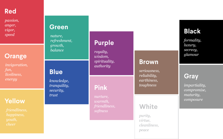
From this, we infer that most accountants want to project an image that is serious, subdued and appeals to more mature consumers. These align with the following colors:

Accountants are as consistent in their brand personalities as they are in their calculations!
Based on this, we would expect to see a lot of blue, pink, purple, gray and black accounting logos, and very few that are orange, red and yellow.
In reality, we see a whole lot of blue, with a little bit of white, black, and green. Blue has high associations with being perceived as both serious and mature, and black is both subdued and mature, so it seems right on the money that these two colors enjoyed high levels of popularity with accounting firms.
At first glance, the popularity of green is confounding: it doesn’t rank high with being serious, subdued, or mature. What’s not taken into account, however, is its cultural color association, at least in the United States: money. Cold, hard, reliable American greenbacks are, well, green. While, on the face of it, green might not inherently inspire competence and sophistication, it has a deeper meaning within our culture, and therefore finds its ways into the logos of financial industries.
Be audit you can be: what colors should accountants explore?
Considering their overwhelming preference for blue, it seems that most accountants make smart, if safe, bets when selecting logo colors.
But what if you want to make a bit of a riskier investment and stand out from the crowd? If you’re willing to stray from the tried-and-true, blue-and-black standards of accounting logo colors, there are several that ensure that you visually stand out, but still maintain a brand personality that’s high in competence and sophistication.
Both pink and purple are perceived as serious, subdued, and mature, yet appear in less than 6% of all accounting industry logos. If you want to play up your intelligence, consider the wisdom of purple. If you’d like to attract a new customer base, nurture them with a pink logo.
You could also follow in the footsteps of these trailblazing accounting brands who have chosen to play up other brand personality traits in their logo color choices.
-
Designer ludibes uses a bright red in this logo design for Red Rock Wealth Management. Though red isn’t a popular choice for the industry, the color corresponds to the firm’s location in Redrock Canyon, appealing to their target audience.
-
Pink lends this logo for a venture capitalist a modern and cool vibe, perfect for a company that funds cutting-edge research projects. Logo design by Bion for YZSIDE.
-
A bright purple logo will undoubtedly help you stand out in a sea of blue accounting logos, especially when your target audience is millennials who are just beginning to invest. Design by pabs. for Orza.
As you seek to design your accounting logo, you’ll want to take your brand personality into account, and think about the traits you most want to convey. Color is a personal choice, but but understanding color psychology in marketing can help you make an informed decision for your small business.
Have we confirmed your choice for blue? Or made you think pink? Either way, find a designer with expertise in your industry to help you bring your idea to life.
Blue collar, white collar, purple collar: what are the logo colors of other industries?
Get an accounting logo design now!
Want to know more about how design impacts business?
Subscribe and be inspired by our best tips, trends and resources.
We'll also send you the occasional marketing email and promotion (which you can opt-out of anytime).