Categories
How it works
Find a designer
Inspiration
Studio
1 800 513 1678
Log in
Log in
Home
Logo design
Logo design contests
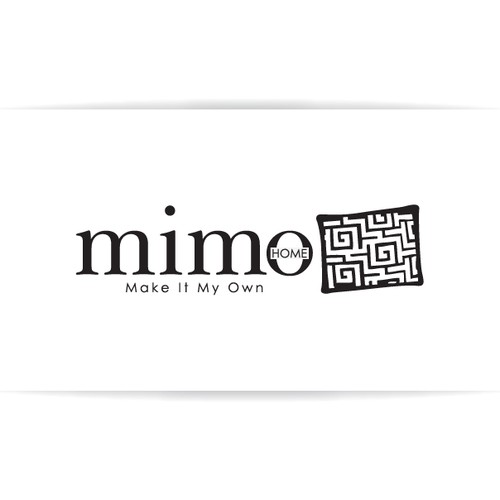
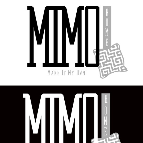
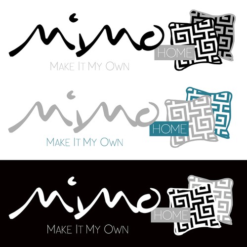
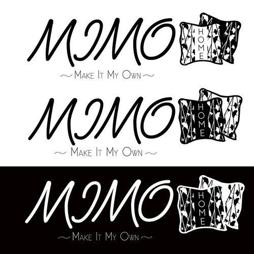
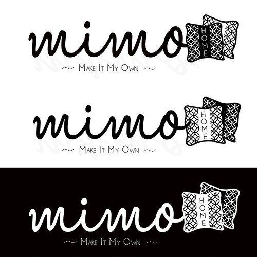
logo for MIMOhome
logo for MIMOhome
by
Dzingher
44% (13) of active designers received comments
66% rated or declined designs
9 contests (0 refunds)
Guaranteed
The client has guaranteed to award the prize.
Watchers
(5)
5 people are watching for updates.
Brief
Designs
(132)
Designs
(132)
Brief
Designs
(132)
Share on Facebook
Share on Twitter
Share on Pinterest
This contest has finished. Congratulations to the winning designer
Pickled-Inkling
!
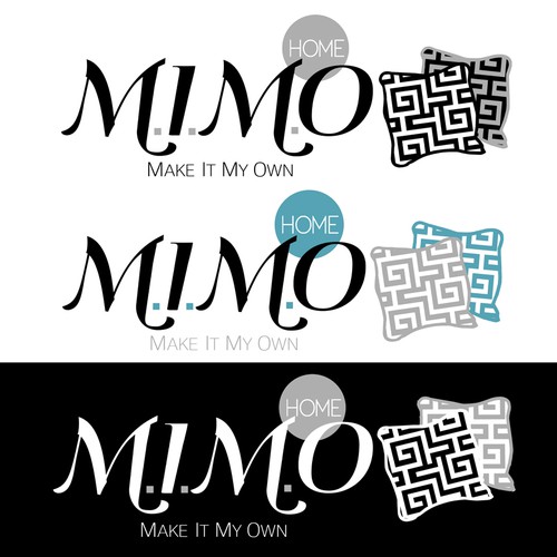
Winning entry
#128
by
Pickled-Inkling
Deleted by 99designs
Withdrawn by designer
Declined
Winner
Entries
All
(20)
All (20)
Unrated (13)
1–2 stars (1)
3–5 stars (6)
Declined and withdrawn (113)
All
(20)
Unrated
(13)
1–2 stars
(1)
3–5 stars
(6)
(113)
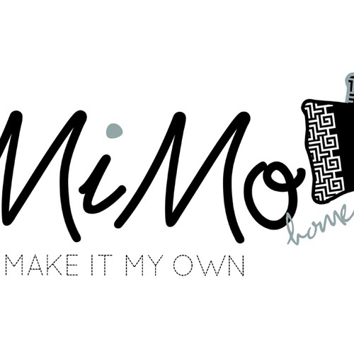
#131
by
Pickled-Inkling
Deleted by 99designs
Withdrawn by designer
Declined
#128
by
Pickled-Inkling
Deleted by 99designs
Withdrawn by designer
Declined
Winner
#88
by
Pickled-Inkling
Deleted by 99designs
Withdrawn by designer
Declined
#78
by
Pickled-Inkling
Deleted by 99designs
Withdrawn by designer
Declined
#76
by
Pickled-Inkling
Deleted by 99designs
Withdrawn by designer
Declined
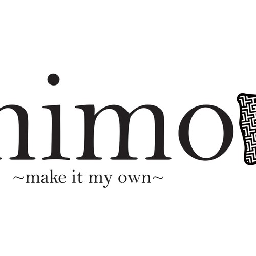
#75
by
Pickled-Inkling
Deleted by 99designs
Withdrawn by designer
Declined
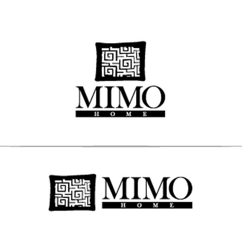
#106
by
dzanie
Deleted by 99designs
Withdrawn by designer
Declined
#133
by
Pickled-Inkling
Deleted by 99designs
Withdrawn by designer
Declined
#132
by
dzanie
Deleted by 99designs
Withdrawn by designer
Declined
#129
by
Pickled-Inkling
Deleted by 99designs
Withdrawn by designer
Declined
#127
by
Pickled-Inkling
Deleted by 99designs
Withdrawn by designer
Declined
#126
by
Pickled-Inkling
Deleted by 99designs
Withdrawn by designer
Declined
#125
by
Pickled-Inkling
Deleted by 99designs
Withdrawn by designer
Declined
#124
by
Pickled-Inkling
Deleted by 99designs
Withdrawn by designer
Declined
#123
by
Pickled-Inkling
Deleted by 99designs
Withdrawn by designer
Declined
#122
by
Pickled-Inkling
Deleted by 99designs
Withdrawn by designer
Declined
#120
by
dzanie
Deleted by 99designs
Withdrawn by designer
Declined
#119
by
dzanie
Deleted by 99designs
Withdrawn by designer
Declined
#118
by
dzanie
Deleted by 99designs
Withdrawn by designer
Declined
#111
by
dzanie
Deleted by 99designs
Withdrawn by designer
Declined
Home
Browse categories
How it works
Find a designer
Inspiration
99designs Pro
Design services
Design contests
1-to-1 Projects
Find a designer
Discover inspiration
99designs Studio
99designs Pro
Get a design
Logo design
Business card
Web page design
Brand guide
Browse all categories
Support
1 800 513 1678
Help Center
Resources
Pricing
Become a designer
Blog