Categories
How it works
Find a designer
Inspiration
Studio
1 800 513 1678
Log in
Log in
Home
Logo design
Logo design contests
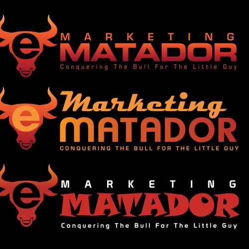
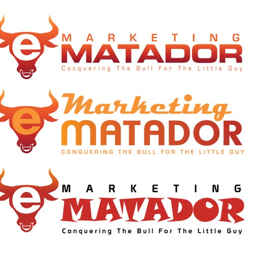
Logo/Header Image for eMarketingMatador.com
Logo/Header Image for eMarketingMatador.com
by
Keith Hagen
13% (2) of active designers received comments
100% rated or declined designs
3 contests (0 refunds)
Fast-tracked
Following the open round, the client will select a winning design. There is no refinement stage.
Guaranteed
The client has guaranteed to award the prize.
Watchers
(1)
1 people are watching for updates.
Brief
Designs
(56)
Designs
(56)
Brief
Designs
(56)
Share on Facebook
Share on Twitter
Share on Pinterest
This contest has finished. Congratulations to the winning designer
ualz
!
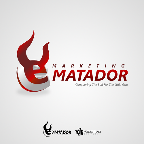
Winning entry
#25
by
ualz
Deleted by 99designs
Withdrawn by designer
Declined
Winner
Entries
All
(18)
All (18)
Unrated (0)
1–2 stars (6)
3–5 stars (12)
Declined and withdrawn (38)
All
(18)
Unrated
(0)
1–2 stars
(6)
3–5 stars
(12)
(38)
#25
by
ualz
Deleted by 99designs
Withdrawn by designer
Declined
Winner
#53
by
podd
Deleted by 99designs
Withdrawn by designer
Declined
#52
by
podd
Deleted by 99designs
Withdrawn by designer
Declined
#14
by
podd
Deleted by 99designs
Withdrawn by designer
Declined
#13
by
podd
Deleted by 99designs
Withdrawn by designer
Declined
#40
by
Kevin2032
Deleted by 99designs
Withdrawn by designer
Declined
#39
by
Kevin2032
Deleted by 99designs
Withdrawn by designer
Declined
#12
by
podd
Deleted by 99designs
Withdrawn by designer
Declined
#11
by
podd
Deleted by 99designs
Withdrawn by designer
Declined
#9
by
JonathanS
Deleted by 99designs
Withdrawn by designer
Declined
#8
by
designbaked
Deleted by 99designs
Withdrawn by designer
Declined
#6
by
JonathanS
Deleted by 99designs
Withdrawn by designer
Declined
#7
by
Elko
Deleted by 99designs
Withdrawn by designer
Declined
#4
by
JonathanS
Deleted by 99designs
Withdrawn by designer
Declined
#1
by
JonathanS
Deleted by 99designs
Withdrawn by designer
Declined
#17
by
JonathanS
Deleted by 99designs
Withdrawn by designer
Declined
#16
by
gholl33
Deleted by 99designs
Withdrawn by designer
Declined
#10
by
JonathanS
Deleted by 99designs
Withdrawn by designer
Declined
Home
Browse categories
How it works
Find a designer
Inspiration
99designs Pro
Design services
Design contests
1-to-1 Projects
Find a designer
Discover inspiration
99designs Studio
99designs Pro
Get a design
Logo design
Business card
Web page design
Brand guide
Browse all categories
Support
1 800 513 1678
Help Center
Resources
Pricing
Become a designer
Blog