This contest has finished. Congratulations to the winning designer dbunk
!
Winning entry
Entries
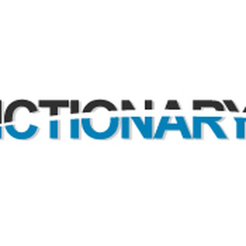
#1325
by hyperborea

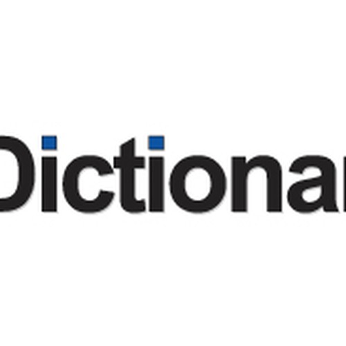
#1287
by drunken_guy


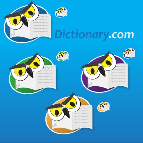

#2874
by 100designs

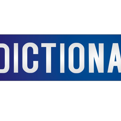
#2873
by 100designs

#2867
by 100designs
#2866
by 100designs

#2865
by 100designs
#2857
by studiobugsy