This contest has finished. Congratulations to the winning designer DAFIdesign
!
Winning entry

Entries
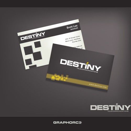
#2884
by DAFIdesign
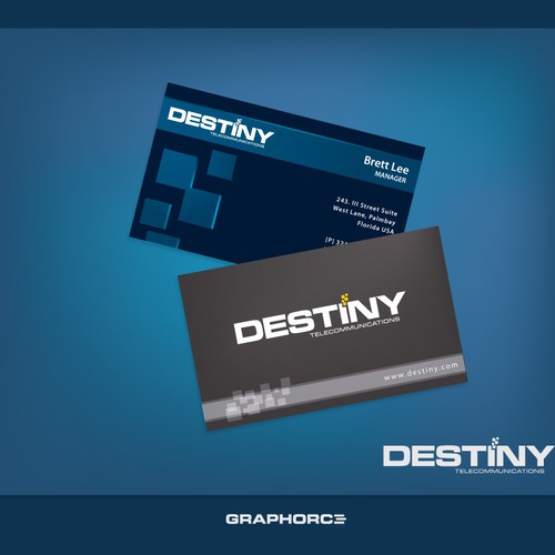
#2862
by DAFIdesign

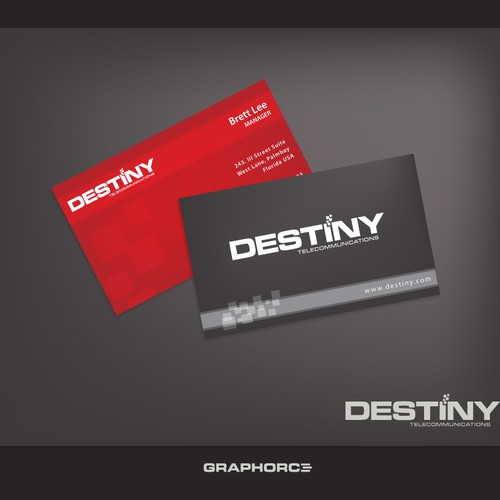
#2649
by lucy mango

#2588
by lucy mango
#2586
by lucy mango


#2159
by andrEndhiQ

#2157
by andrEndhiQ

#2155
by andrEndhiQ
#1818
by andrEndhiQ

#1816
by andrEndhiQ

#1774
by DAFIdesign
#1756
by DAFIdesign

#1755
by DAFIdesign

#1547
by andrEndhiQ

#548
by DAFIdesign

#524
by DAFIdesign

#422
by DAFIdesign

#360
by DAFIdesign

#337
by DAFIdesign


#2986
by Team Esque

#2983
by Team Esque

#2975
by DigitalPunk