Background information
Industry
Travel & Hotel
App description
MOTO-MEMO is a note taking application for motorcycle riders. The app allows users to document their ride experience.
This contest is for only 3 screens. The app has 7 screens total, but I will work with the winner 1-on-1 to get the remaining screens.
Existing website
Visual style
Style/theme ideas
The app is to document notes about motorcycle riding, such as maintenance records, fueling records, lodging details, and overall ride experiences. Traditionally this information is kept with an old-fashioned notebook and pencil, if it is even kept at all.
I want my app to make the input of this information so easy and pleasant that inputting this information is something that the user looks forward to.
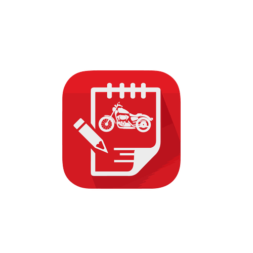
The theme should be simple and optimized for input. I recently ran a contest to get the app icon designed and the winning entry is attached. I would appreciate using this "theme" as a starting point, but I am open to another design theme if it is simple and intuitive.
I can't emphasize enough that I want simple and designed for input, which means large buttons and easy to understand symbols or words.
Inspirational websites
Content details
App name
MOTO-MEMO
Screen descriptions
There are three screens in this contest. The remaining four screens will be designed 1-on-1 with the winner.
1) Home screen- this screen is a navigation page which allows the user to go to other screens to input or review information.
2) Fuel Input- this screen is to input data while refueling. This is one of the main screens of the app. I will use this screen to see if the designer is accomplishing the simple and optimized for input requirement.
3) Fuel Log- this screen is where records from fueling are displayed.
The work flow and a detailed description of each page is included in the attached design guide.
I have also attached wireframes which I used to lay out my vision of how the app should flow. They should be used as a starting point and to get a sense of what I am looking for, but other design themes or directions will be considered. I can't emphasize enough that I want ease of input to be the theme, which means big buttons with logical names or intuitive symbols.
Device type
iPhone
What to avoid
I don't want anything complicated, ornate, or fancy. Keep the fonts simple and readable and use symbols if possible. I don't want small buttons or wordy descriptions on buttons. The flow of the app screens should be logical and intuitive.
I want to use this app to show the design principle of "optimized for input". I believe that many apps combine the inputting of data with the viewing of the resulting information.
Later versions of the app will have a way to export and view the journal in a more pleasant way.
Contest deliverables
3 x App screen design(s)
Final files
If you use fonts that require a license, confirm with the client they're ok with it. For licensing reasons, it is better to provide your client with information on how to acquire the font rather than providing the actual files.