Background information
Name to incorporate in the logo
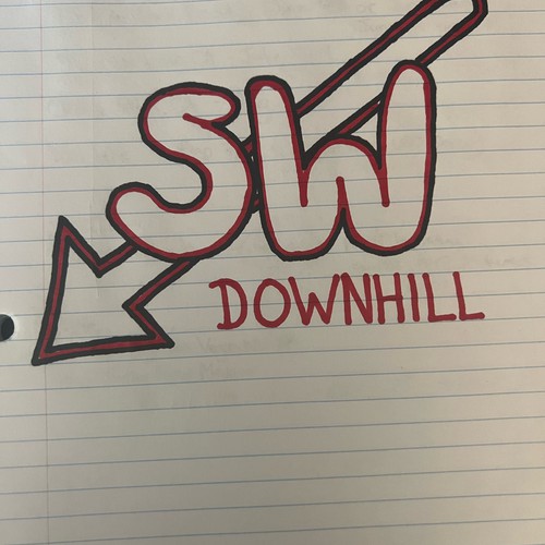
SW Downhill
Slogan to incorporate in the logo
Description of the organization and its target audience
The Southwest Downhill Series is a regional downhill mountain bike race series located in the Southwest region of the United States (CA, AZ, NV, NM, UT). The series consists of four events where athletes compete against each other for the fastest time from point a to point b.
Industry
Sport


References
Other notes
I would like the logo to be simple and straight to the point. "SW" in large letters, with the word "Downhill" either beside or underneath.
Colors should represent the Southwest region of the United States. I am also potentially interested in the background being the shape of the combined states CA, NV, and AZ.
View attached sketch for further inspiration.
Contest deliverables
1 x Logo
Final files
If you use fonts that require a license, confirm with the client they're ok with it. For licensing reasons, it is better to provide your client with information on how to acquire the font rather than providing the actual files.
Text in logos should be converted to outlines.
I like the playfulness of it, the font, and simplicity.