Background information
Name to incorporate in the logo
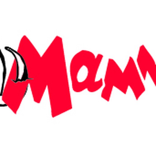
Mammoth
Slogan to incorporate in the logo
Description of the organization and its target audience
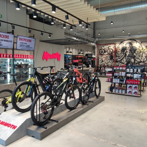
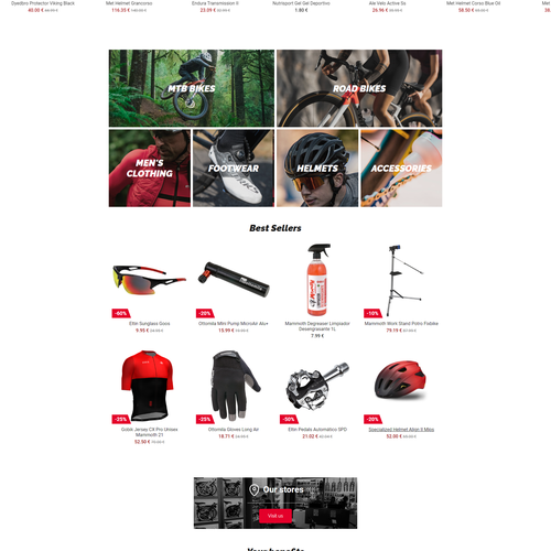
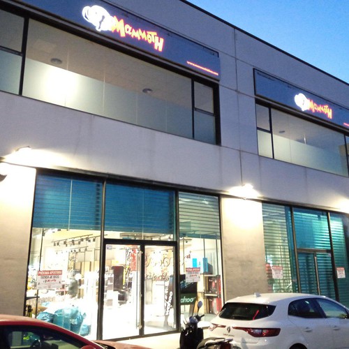
Our brand is Mammoth and we are dedicated to the sale of bicycles and all kinds of material for the practice of cycling for all levels and disciplines. We do it through our physical stores and our e-commerce Mammothbikes.com. We are a young and dynamic company that is growing and very oriented towards our objectives.
We consider that our corporate identity is currently outdated and isn’t in line with our values and objectives, which are, among others, the culture of effort, honesty with our clients, valuing the trust they place in us and ensuring that we always offer them a good service.
We need to restyling our identity, looking for a fresher and more current image that helps us reach our target audience. People with a lot of vitality, dynamic and active, who like nature and practice sports outdoors and who are committed to sustainable mobility.
For this we want to start with the redesign of our logo. We want to update it, make it fresher, simplified, original and memorable. That transmits strength, confidence, security and dynamism.
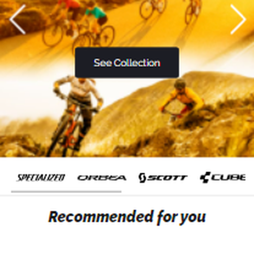
Some of our competitors are Deporvillage.com, Bikester.es, Wiggle.com, Bicimarket.com, Alltricks.es
Some important brands in our sector are Specialized, Giant, Scott, Orbea, Merida, Cannondale, Brompton and Cube.
Industry
Retail
Visual style
Colors to explore
Other color requirements
Red: C0 M100 Y81 K0 R228 G0 B43 HEX E4002B
Black: C0 M0 Y0 K100 R26 G26 B26 HEX 1A1A1A
Style Attributes
Design inspiration
Contest deliverables
1 x Logo
Final files
If you use fonts that require a license, confirm with the client they're ok with it. For licensing reasons, it is better to provide your client with information on how to acquire the font rather than providing the actual files.
Text in logos should be converted to outlines.