This contest has finished. Congratulations to the winning designer Jack_Design
!
Background information
Name to incorporate in the logo
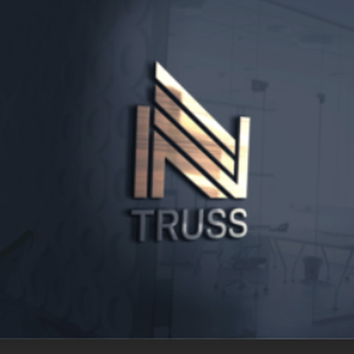
Volkov Truss
Slogan to incorporate in the logo
I'd Truss That
Description of the organization and its target audience
Custom wood truss manufacturing. Target audience would be builders, contractors, lumber yards and home centers.
Industry
Construction


Contest deliverables
1 x Logo
Final files
Layered vectors
Screen quality
Fonts
If you use fonts that require a license, confirm with the client they're ok with it. For licensing reasons, it is better to provide your client with information on how to acquire the font rather than providing the actual files.
Text in logos should be converted to outlines.