Background information
Name to incorporate in the logo
Candor
Slogan to incorporate in the logo
Description of the organization and its target audience
We’re an indie punk/pop punk band. We know we would like some kind of picture element incorporated into our name logo i.e. make the “O” in Candor a skull as an example. That of course is just an example, so feel free to get creative with it. The name IS a required element of the logo, and the logo must only be one color. We want a logo that feels like it represents us as a band, and that doesn’t feel like it goes against the grain of our genre. Something kinda playful, but legible. One idea I think would be neat if it were legible is using illustrated hands to form the letters, but we’re really open to different ideas. We just don’t want something that feels aggressive. We want something that feels sleek, and mature, but hip. We’re not an aggressive band, we’re definitely more on the pop punk verging on pop rock spectrum. Logo needs to be created as a vector file as it will be used in many different ways and need to be able to be easily manipulated both in color and size. Any non-vector file will not be accepted.
Industry
Art & Design

References
Attachments
Other notes
I’m interested in combination logos.
Contest deliverables
1 x Logo
Final files
If you use fonts that require a license, confirm with the client they're ok with it. For licensing reasons, it is better to provide your client with information on how to acquire the font rather than providing the actual files.
Text in logos should be converted to outlines.
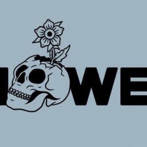
I like how simple, yet striking this logo is. It’s playful and not overly masculine/aggressive .