Background information
Name to incorporate in the logo
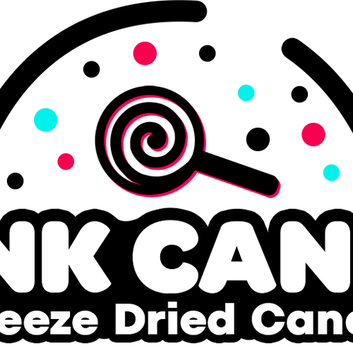
BNK CANDI
Slogan to incorporate in the logo
Freeze Dried Candy
Description of the organization and its target audience
We sell candy, freeze dried candy, and freeze dried products.
Industry
Food & Drink
Visual style
Colors to explore

Other color requirements
Here are some colors I have been going with. They seem to go with things associated with "candy." However, if you believe other colors would work much better, then please make suggestions/add your own.
Main colors: 00ddba, ffbb00, ff217a
Background: 1c2651, 406390
Style Attributes
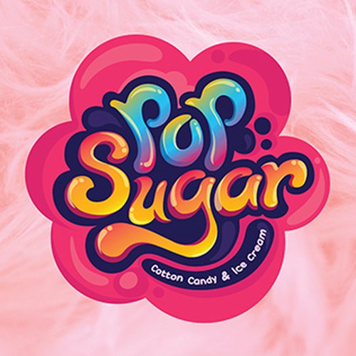
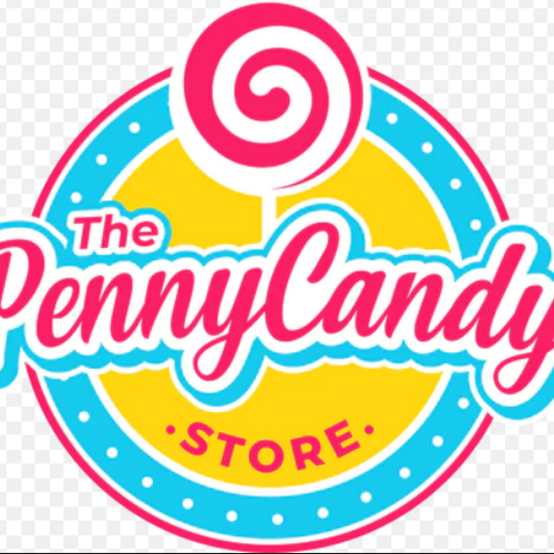
Design inspiration
References
Other notes
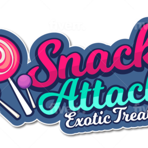
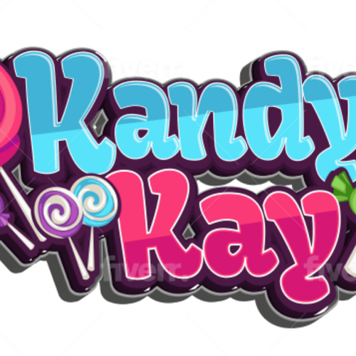
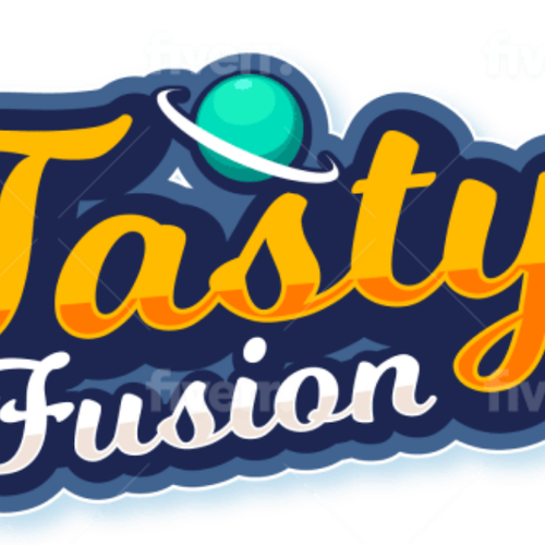
I have attached our current logo and candy logos I found online that "pop." I want it to look good even when the lettering is removed. The current logo design is kind of like a star field, with a lollipop in the middle, or it could be seen as planets. If you believe it should change entirely, by all means, please do. I really just want a theme that is associated with candy in some way. I am not looking for crazy gradient colors (unless one looks truly amazing and eye-catching), this needs to be somewhat simple and easy to look at.
A problem with our current logo is that it lacks color and "BNK CANDI" doesnt really stand out. I want this logo to be eye-catching, but also be associated with candy.
Our current font is Omnes-Black for "BNK CANDI" and TT Fors Trial- Bold for "Freeze Dried Candy." I'd like to keep these or use similar fonts that are easy to read, but somewhat "fun." I want to be flexible with this logo. In addition, I think it would look best if "BNK CANDI" is on the same line.
In summary, logo needs to be easy to read, eye catching, colorful, and shows the customer we are associated with candy through icons, colors, etc...
Thank you!
Contest deliverables
1 x Logo
Final files
If you use fonts that require a license, confirm with the client they're ok with it. For licensing reasons, it is better to provide your client with information on how to acquire the font rather than providing the actual files.
Text in logos should be converted to outlines.
Current logo