Background information
Name to incorporate in the logo
Local2Global
Slogan to incorporate in the logo
Description of the organization and its target audience
A startup faith-based nonprofit organization that connects local people to global humanitarian projects all around the world (mostly in Asia). The brand style is professional, inspirational and motivational and seeks to convey a sense of movement, urgency, and compassion.
Industry
Community & Non-Profit
Visual style
Colors to explore


Other color requirements
Colors we like, but are not required:
Black / White
Navy Blue: cmyk (94%, 37%, 0%, 76%)
Bright Orange: cmyk (0%, 55%, 79%, 1%)
Medium Blue: cmyk (88%, 35%, 0%, 32%)
Style Attributes
Design inspiration
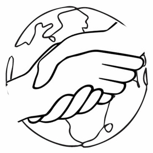
This is a rough concept we put together that is the closest we could come to an idea we liked. But, we want something more polished and professional with cleaner lines and a graphic that feels more seamless. This design feels a little forced and busier than what we are looking for. It is also too youthful and cartoon-like than what we are looking for.
References
Attachments
Other notes
We're looking for an abstract minimal style 1 or 2 color logo. We don't want something too cartoon-like. We are looking for something that is modern and trendy but simple with clean lines.
Some ideas we have had include the following below, but we are open to new creative ideas that imply a local to global partnership connection or that give a sense of movement and connection from local to global.
Hands & A Globe or Hands that are the Globe?
We like the idea of having two hands (both adult and both equal in size and in line/level with each other - not at an angle - to give the idea of a partnership. Use a traditional handshake or a "brotherly handshake"). We'd like to somehow combine that with a globe or abstract mark that makes you think of a globe.
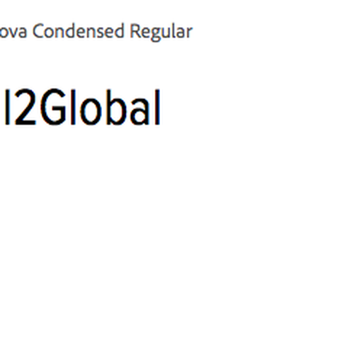
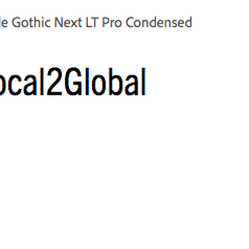
We have been leaning toward Sans Serif fonts that are a little taller and condensed. We do not want a font that is too rounded or youthful looking.
Contest deliverables
1 x Logo
Final files
If you use fonts that require a license, confirm with the client they're ok with it. For licensing reasons, it is better to provide your client with information on how to acquire the font rather than providing the actual files.
Text in logos should be converted to outlines.



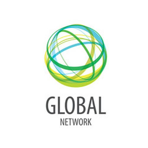
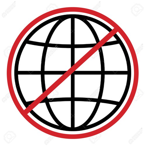



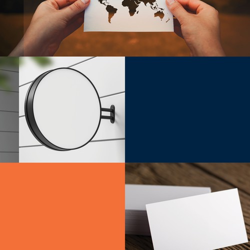
We like this graphic of a globe. It's simple and clear without looking too plain or sterile. It looks professional but approachable. It is not too youthful or messy.