Background information
Name to incorporate in the logo
QOOL and then a Q separately
Slogan to incorporate in the logo
No
Description of the organization and its target audience
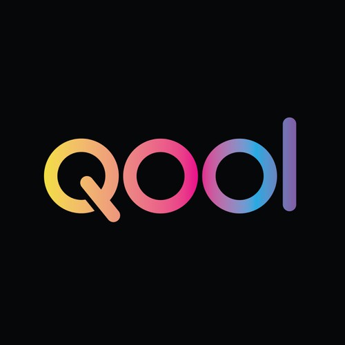
I had the below logo done for my youth performance socks company (think older kids pre-teen to teen not little kids) and I want to change it ever so slightly so the letters are more bubble-like.
The most important thing is that it works for all letters in the English alphabet because the socks will have the same font type and words on them. The letters have to be printed on the sock.
So the letters have to be readable, and look ok even if they are printed kind of small.
I like the colorways ok but I wouldn't mind if those were tweaked too - maybe the slightish bit more boyish but also appealing to girls.
Industry
Retail
Visual style
Colors to explore
Other color requirements
Style Attributes
Design inspiration

Contest deliverables
1 x Logo
Final files
If you use fonts that require a license, confirm with the client they're ok with it. For licensing reasons, it is better to provide your client with information on how to acquire the font rather than providing the actual files.
Text in logos should be converted to outlines.