Background information
Name to incorporate in the logo
Board game bar logo with tavern design, inspired by vintage ice breaker boat atmosphere - official name is "Le Brise-glace"
Slogan to incorporate in the logo
Description of the organization and its target audience
The new generation wants to get away from social networks and virtual lives, they now want to reconnect with themselves and their loved ones. The era of Instagram is starting to disappear, and human contact is becoming more and more important. So we propose a bar where you can have a drink, eat a snack, and share a moment with friends or strangers around a selection of games easy to learn and quick to play.
We love to play board games, I think they allow us to exchange differently and to know more deeply the other players, and to get to know the other players more deeply. It is also a unique way to break the ice and to meet someone, an excuse that allows us to reveal ourselves and quickly avoid false pretenses.
"Le Brise-Glace" means The IceBreaker in French, referring to the boat used to pierce through the ice, but also the concept of breaking barriers between strangers, which is our core mission.
What we are doing strongly looks like a board game café, but we do not want to attract experts of the genre, but novice and people who never played board games before and help them through the fear of learning something new and giving a warm and comforting environment to do so.
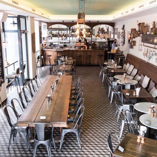
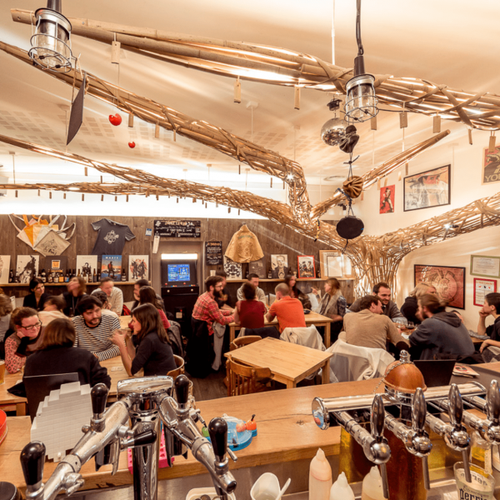
Our decoration will be centered around the concept of the icebreaker as a boat but still quite soft as we do not want to appear as a theme bar.
The logo should be ideally an emblem, even tho we are not closed on this idea. It should be in color, but still softly, as we want it to speak to adults and give this nightlife vibe. You can incorporate some elements "fantastical" if you feel like it's appropriate. Finally, it should reflect an old tavern atmosphere, with highlights and lowlights, and be easy to recognize and easy to understand. It is also important that it gives potential customers a warmth feeling, as our bar will be very warm in its decoration and furniture.
We also like the idea of different policies for the text.
Most importantly, this logo should reflect that our bar is a place where you can play board games with your friends - or meet new people through open table and simpler party game. Hove where, it is not mandatory to play games to stay, and we also offer the traditional bar experience. In this reality, the logo should not be too specific concerning the board games offer, also because we won't brand our bar as a board game bar.
Industry
Bar & Nightclub


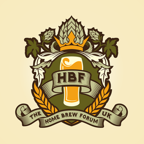
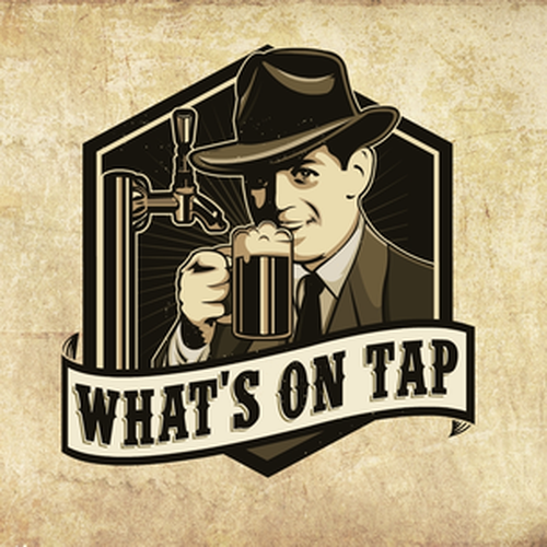
References
Other notes
If you have any questions that would help you better understand the concept, do not hesitate. Also we will begin shortly on the construction of the actual bar but I will add some documents of what it will look like, more or less, inside and other concept we feel close to.
https://www.tavernoftales.com/
https://www.lesmauvaisjoueurs.com/
Contest deliverables
1 x Logo
Final files
If you use fonts that require a license, confirm with the client they're ok with it. For licensing reasons, it is better to provide your client with information on how to acquire the font rather than providing the actual files.
Text in logos should be converted to outlines.
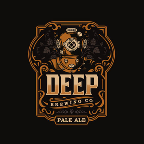
PROS - Vintage design, tavern-like, emblem, complex, easy to understand, epic in a way
CONS - too colorful, should give a certain idea of night life