Background information
Name to incorporate in the logo
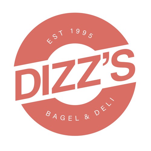
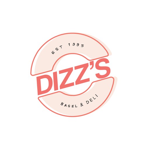
Dizz's
Slogan to incorporate in the logo
Bagel & Deli, Est. 1995
Description of the organization and its target audience
Hi there - My husband, and I are opening a bagel shop in the town we live in, just outside of Montreal, Canada. Our family (three generations now) have all been in the bagel business and although we are biased, they are the BEST bagels. They have been made the same way for decades, hand rolled and wood fired with a secret ingredient that gives them a hint of sweetness. They are a much denser bagel than anything one would be accustomed to in the US, and everyone up here loves them. Bagels are a way of life around here.
We see an opportunity within our community to be "that" spot where everyone meets up on the weekends and is treated like family. Our community is rapidly expanding with younger families and everyone is looking for a place like this in our area. We are hoping to reach adults 30+ with established careers, HHI above $60-70k per year.
We have purchased an old home and are starting a large construction project to convert it from a residential building into a bagel shop in our lakeside village.
Our concept is really about three things - bagels, sandwiches and prepared foods. We want to provide elevated food in a place that feels homey and current. Not that beige bagel shop you see on every corner.
Our family recently worked with a local designer to update our logo - I have attached their work to this request. Our current store uses our original logo and although we love it, we think it could use some softening up for the second location. As far as the most recent update, we love the outline and playfulness with the shading but we just think the DIZZS is a bit flat, something is missing, and we cannot put our finger on it. We are really hoping to find someone who understands our vibe and can grow with us through website design, packaging, social media and more.
We really want our brand to feel warm, homey, current, familiar, genuine, approachable, intentional, community oriented and timeless. Classic with a twist.
Adjectives we do not want associated with our brand.... trendy, modern, cold, boring, hippie, funky.
In our opinion our original logo is a bit too bold to give off that homestyle/country vibe and the most recent rendition just appears a bit flat with our DIZZ'S section
That being said, we are open to variations of our original logo, the most recent rendition, or something different altogether.
We definitely do not want to lose our personalty and would prefer if Living Coral 16-1546 TCX stay's the main color with a secondary color in the Cantaloupe family. The most recent rendition has Cantaloupe 15-1239 TPG and we like that combo a lot.
Thank you for your help, we look forward to seeing your ideas! :)
** Edit - we noticed with the logo's submitted thus far, we are liking the simpler options with Living Coral as the main color. Thanks so much to everyone who has submitted so far **
Industry
Food & Drink


Contest deliverables
Logo
Winner of this contest
Brand guide
Final files
If you use fonts that require a license, confirm with the client they're ok with it. For licensing reasons, it is better to provide your client with information on how to acquire the font rather than providing the actual files.
Text in logos should be converted to outlines.
I like the circle with the tagline below it, I find the font hard to read. Your not really sure where your eye should go with just one font.