Background information
Name to incorporate in the logo
High Bridge Academy
Slogan to incorporate in the logo
Description of the organization and its target audience
1) Introduction
Hello Designers!
Welcome to High Bridge Academy's branding revamp. We're leaders in Consulting Bootcamps. For years, we've been the bridge for many towards their Consulting Career goals.
As we grow, our Brand needs to, too. We're seeking your expertise to help us shine in this next phase. Let's redefine High Bridge Academy together!
You can learn more about us here: https://highbridgeacademy.com/
2) Objective
Our goal is to refresh our Brand. We're proud of what we've built in the last 3 years, and we want to carry it forward, but with a modern twist. Think of it as merging the trustworthiness of established brands with the zest of modern Startups. Specifically, this project's primary focus is a refreshed logo and updated Brand colors.
3) Specific Changes
3.1) Name: Shift from “High Bridge Management Academy” to "High Bridge Academy."
3.2) Logo:
- Logomark: Keep the bridge. It's symbolic of our mission.
- Wordmark: Update for the new name, and pick a clean, modern font.
3.3) Color Palette: We need brighter, online-friendly colors.
- Move away from the old, muted tones to lively, digital-age colors.
Ideas to consider:
- a) Multi-color (Example: https://www.range.co/)
- b) Single color tones, preferably purple or blue (Example: https://tldv.io/)
3.4) Typography
- We want it bold and clear. It should represent the robustness of our courses.
4) Overall Feel
- Evoke feelings of positivity and openness. We still want to command respect but in a fresh, edtech kind of way.
5) Deliverables
- An updated High Bridge Academy logo.
- A clear, energetic color palette.
- Modern typography.
- Brand guidelines: How to use our colors and fonts on websites, socials, and print.
6) Closing Remarks
Designers, we've set the stage, but if your creativity takes you in a slightly different direction that feels right for our brand, go for it. Let's shape High Bridge Academy's future side by side.
------ BRIEF UPDATE ------
To further assist with your upcoming designs, we've highlighted some key points below:
1. Shield Proportions: We'd love for you to stick to the original shape and proportions of our shield. It's a recognizable feature we'd like to retain.
2. Bridge Evolution: While we're open to subtle tweaks in the bridge's design, we're also curious to see variations that can elevate its simple and premium look.
3. Bridge Depth: Flat designs might not fully convey the depth we're seeking. As you work on the bridge, ensure it retains its dimensionality.
4. Simplicity is Key: Sometimes less is more. Instead of incorporating new elements, focus on how the bridge can be simplified while still keeping its essence.
5. Color Matters: The right color palette can make all the difference. We encourage you to share multiple color options and palettes for your designs, as this will significantly impact the project's success.
6. Web Design Inspiration: To give you better context, here are four websites we admire. Envision a logo that seamlessly integrates with any of these aesthetics:
https://www.addevent.com/
https://tldv.io/
https://www.range.co/
https://www.blinkist.com/
7. Open Communication: Should you need further clarity, want to bounce off ideas, or simply discuss your concepts, please reach out. We value open dialogue and look forward to our continued collaboration.
Industry
Education


References
Other notes
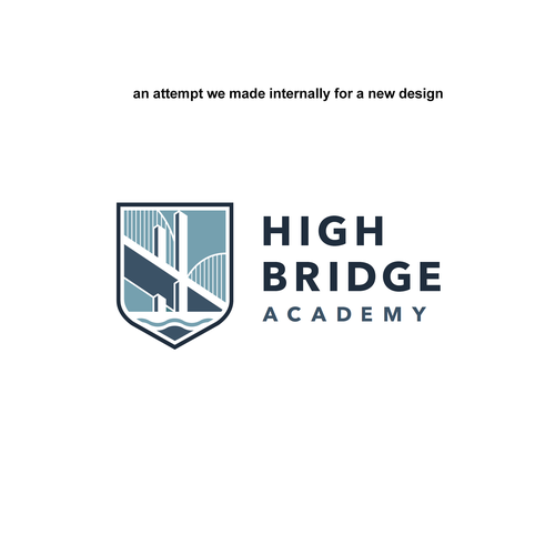
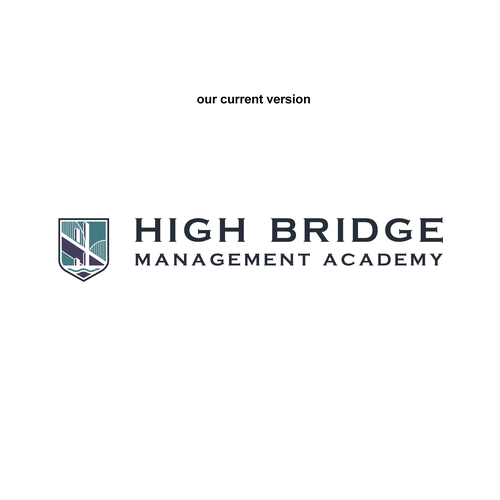
Please find attached our previous logo, along with an attempt we made internally for a new design.
We recognized the need for more experienced hands to bring this vision to life.
We're providing our in-house version solely as a reference, giving you insight into our desired direction.
Additionally, it's important to note that there are no Chinese symbols in the Logomark.
Contest deliverables
1 x Logo
Winner of this contest
1 x Brand guide
Final files
If you use fonts that require a license, confirm with the client they're ok with it. For licensing reasons, it is better to provide your client with information on how to acquire the font rather than providing the actual files.
Text in logos should be converted to outlines.