
Magic of Everything is a digital and print publisher of comics, books, articles. Many of which are related to science fiction and fantasy.
Company’s name was conceived with science fiction and fantasy in mind. Thus, we set out to create a logo that would capture both of these qualities.
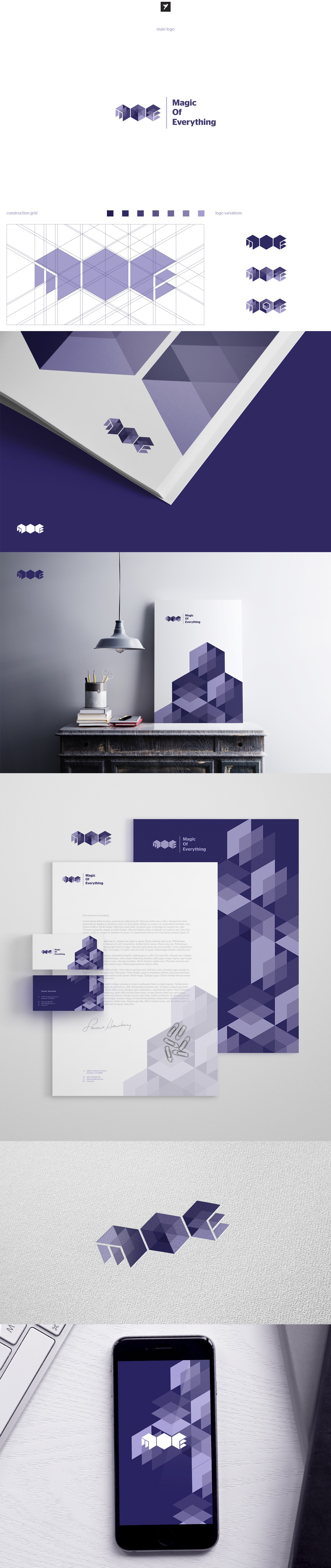
We went with a monogram as the icon for the logo and hexagons as the base. Then incorporated diamond shaped branes/planes that were arranged horizontally and vertically. Different shading to various aspects of those shapes gave them the appearance of being transparent, layered, and three-dimensional. Which also brought forth triangle shapes. The combination of which helped depict not only M, O, and E, but also the concept of spacetime and the universe.
The ‘O’ in the monogram helped us express magic. Giving off the appearance that you are looking at the top of a crystal. The various shades of the shapes that represent the 'O' were also important for this effect.