Created on 99designs by Vista
One of the few things I believe are really important when designing a logo is that it should work in one color.
To be honest, I had idea for this kind of mark a long time ago (used to sketch ideas all the time), only my idea was called "grilled fish" but hey, if I had a chance to bring it to life - this was it!
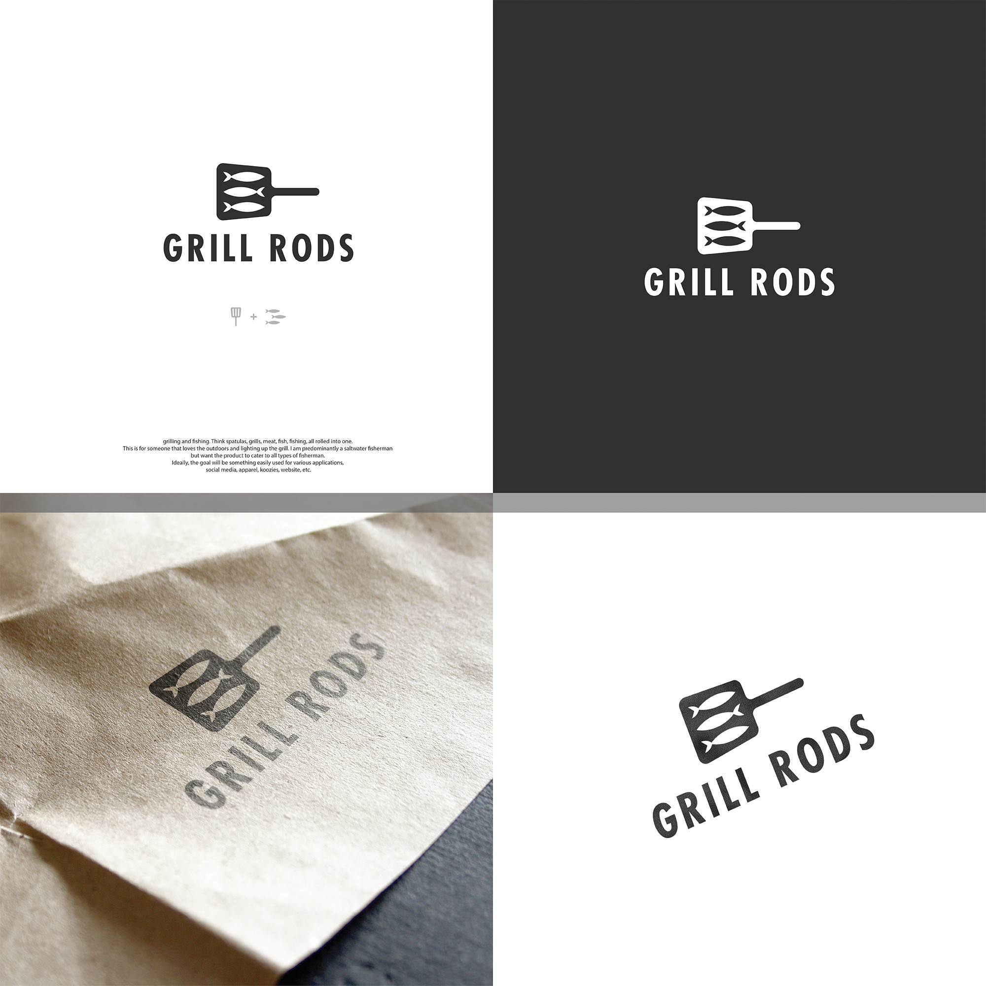
A simple spatula shape with the three fishes in negative space where the slits should be.
Paired with a bold font it can be easily printed on all sort of different materials.
