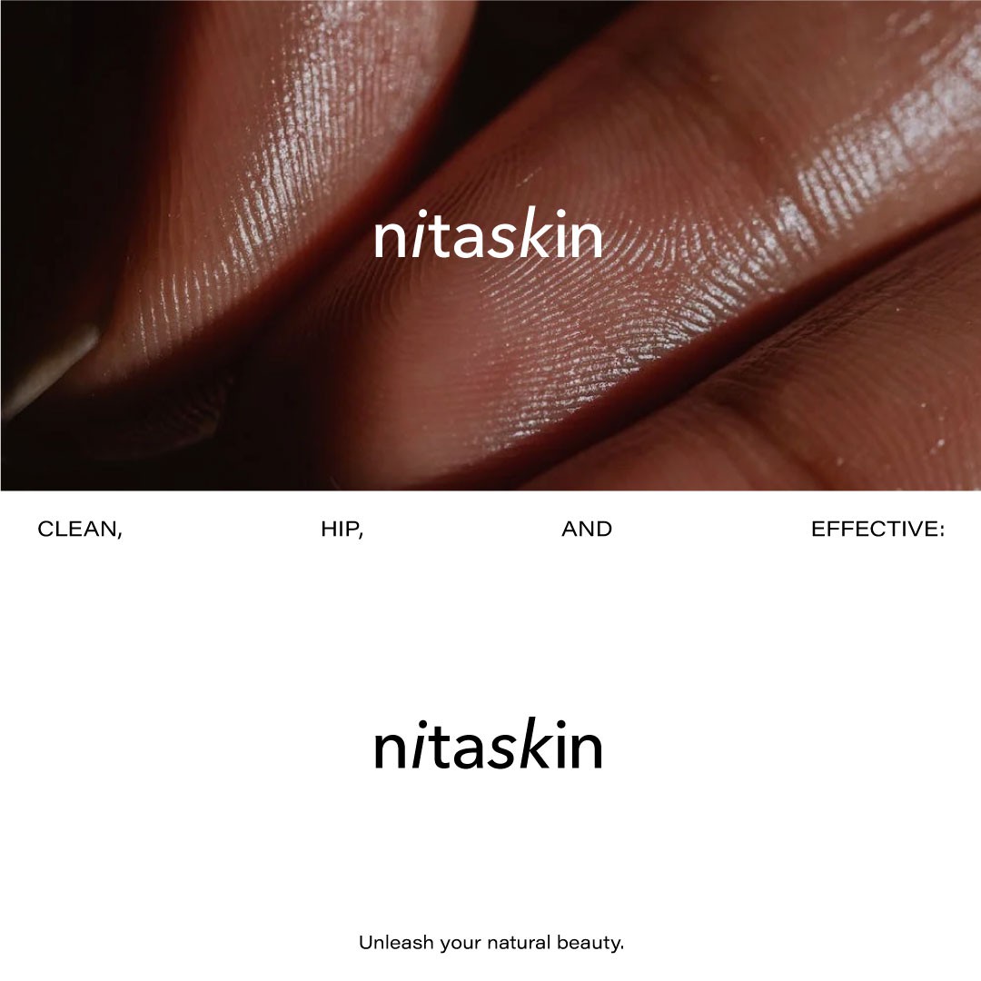

The minimalism of white and black without additional colors suits the style of NITA Skin for several reasons:
Clean and Pure Image: White is associated with cleanliness, purity, and simplicity, which aligns well with the brand's focus on clean skincare. It evokes a sense of freshness and clarity, reflecting the brand's commitment to providing products that are free of harmful ingredients.
Timeless Elegance: Black is often associated with sophistication, elegance, and luxury. By incorporating black into the logo, it adds a touch of timeless elegance, conveying a sense of high-quality skincare products.
Versatility and Focus: The minimalistic color palette of white and black allows the brand to maintain a consistent and cohesive visual identity across various marketing materials. It also helps to direct the viewer's attention to the logo and product itself, highlighting the brand's focus on effective skincare.