An elegant logotype for a community-centric café

43
Created on 99designs by Vista
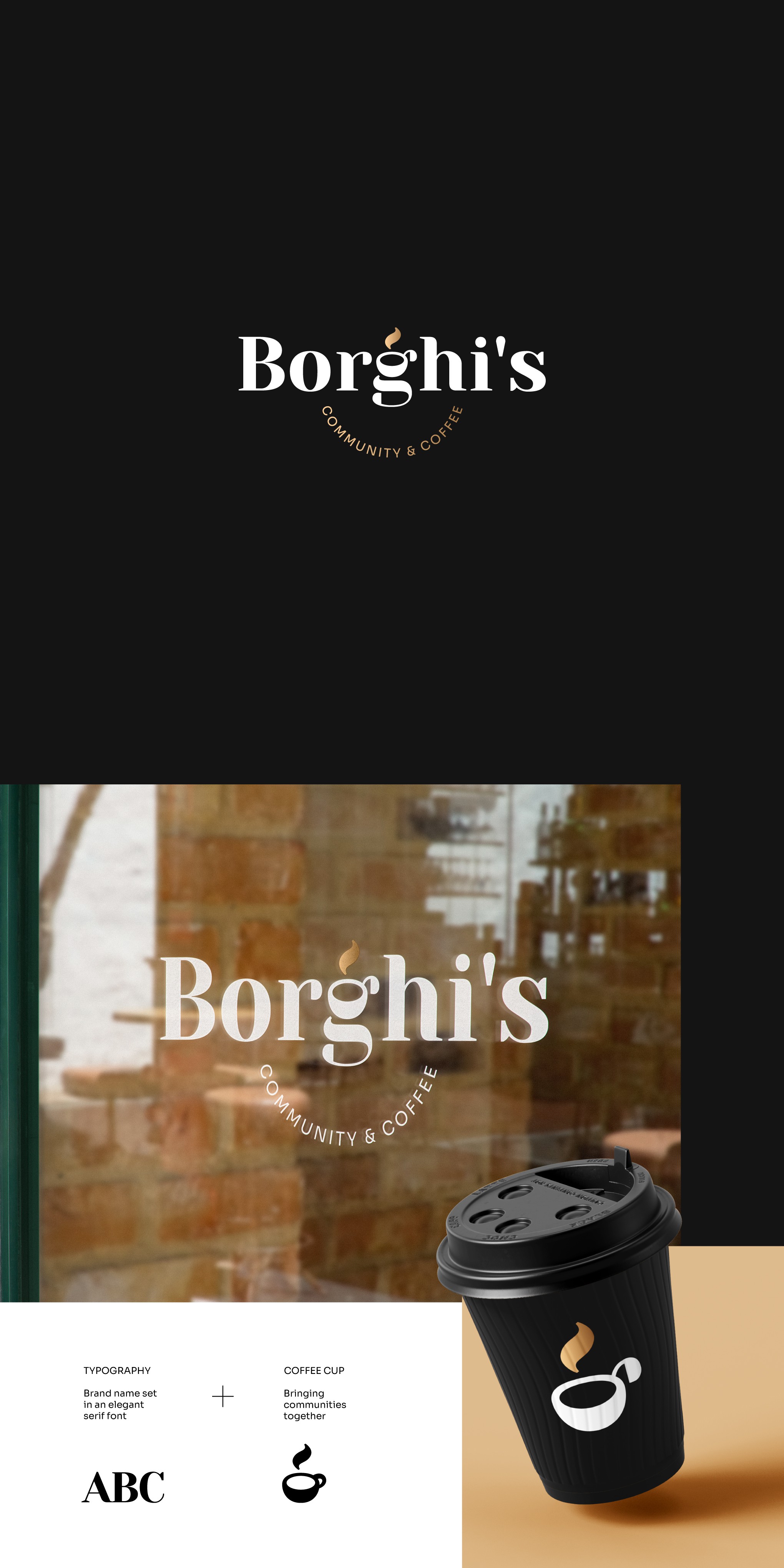
The brief called for an elegant and unique logo for a community-centric café.
I incorporated a steaming coffee cup into the brand name, blending it tastefully with the typography - the result is a bold and stylish wordmark. Since the cup is in the middle, your eyes are naturally drawn to it. The tagline follows symmetry and expands from the centre in a smiling curve - reflecting the community.
On dark backgrounds, the gold accents get to shine and the coffee in the cup looks the richest!
The icon can be used independently to enhance the brand presence.