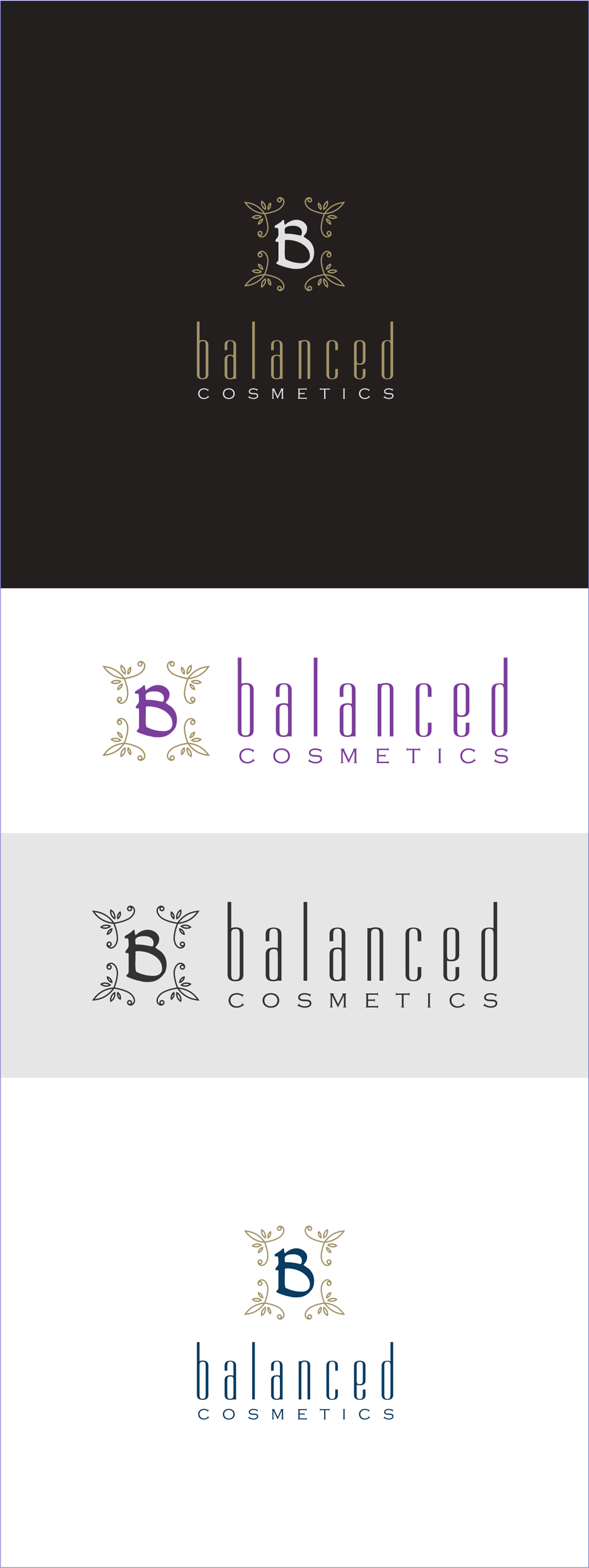
Timeless And Beautiful Logo for Handmade soaps

68
Created on 99designs by Vista
I give luxurious , feminine but strong feel to this logo , to descibe the brandi it self.
Because It's a product that offer handmade soaps and cosmetics that feature quality ingredients such as pumpkin seed oil, beeswax, and honey. Their target audience is young professionals (22-35), mainly female. This product is a handmade product that is free of detergents and unnecessary chemicals and explores the range of quality ingredients (not just vegan ones). So i make this logo not so girly but also not so masculine , i want to reflect beautifullnes without being look vulnerable , and as the result , it's become a timeless logo that can be achieable for their target audience : )