Wordmark logo proposal for an Architectural Design Studio

45
Created on 99designs by Vista
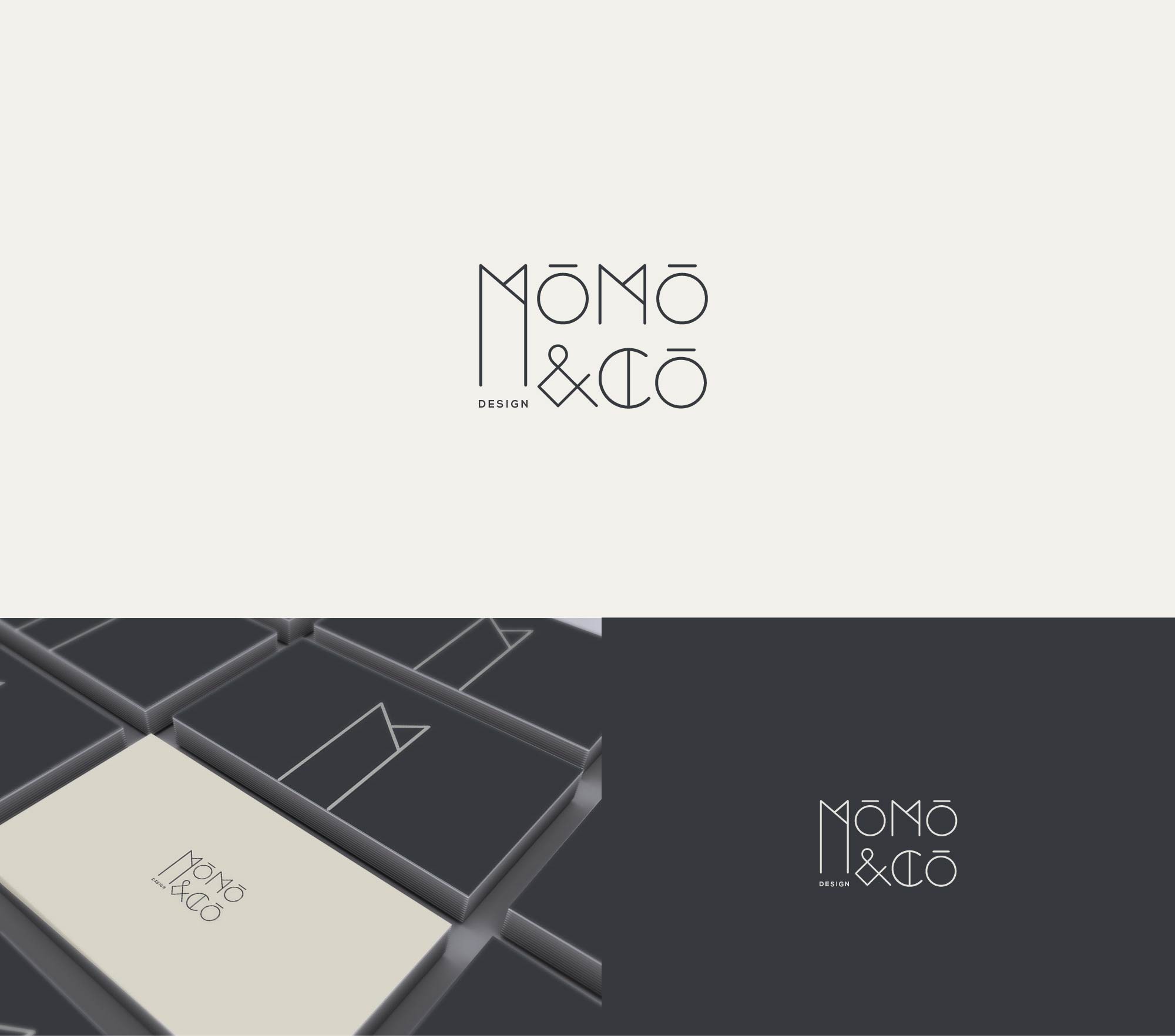
A very clean and modern logo was requested. Among other versions I proposed this one, with an interesting use of typography and geometrical elements. I paid attention to keep the general shape and layout compact and to balance all the decorative elements within it. The sizes, the width of the lines and the distances between shapes were carefully organized. The elongated 'M' could be used as a separate icon, too.