
Created on 99designs by Vista
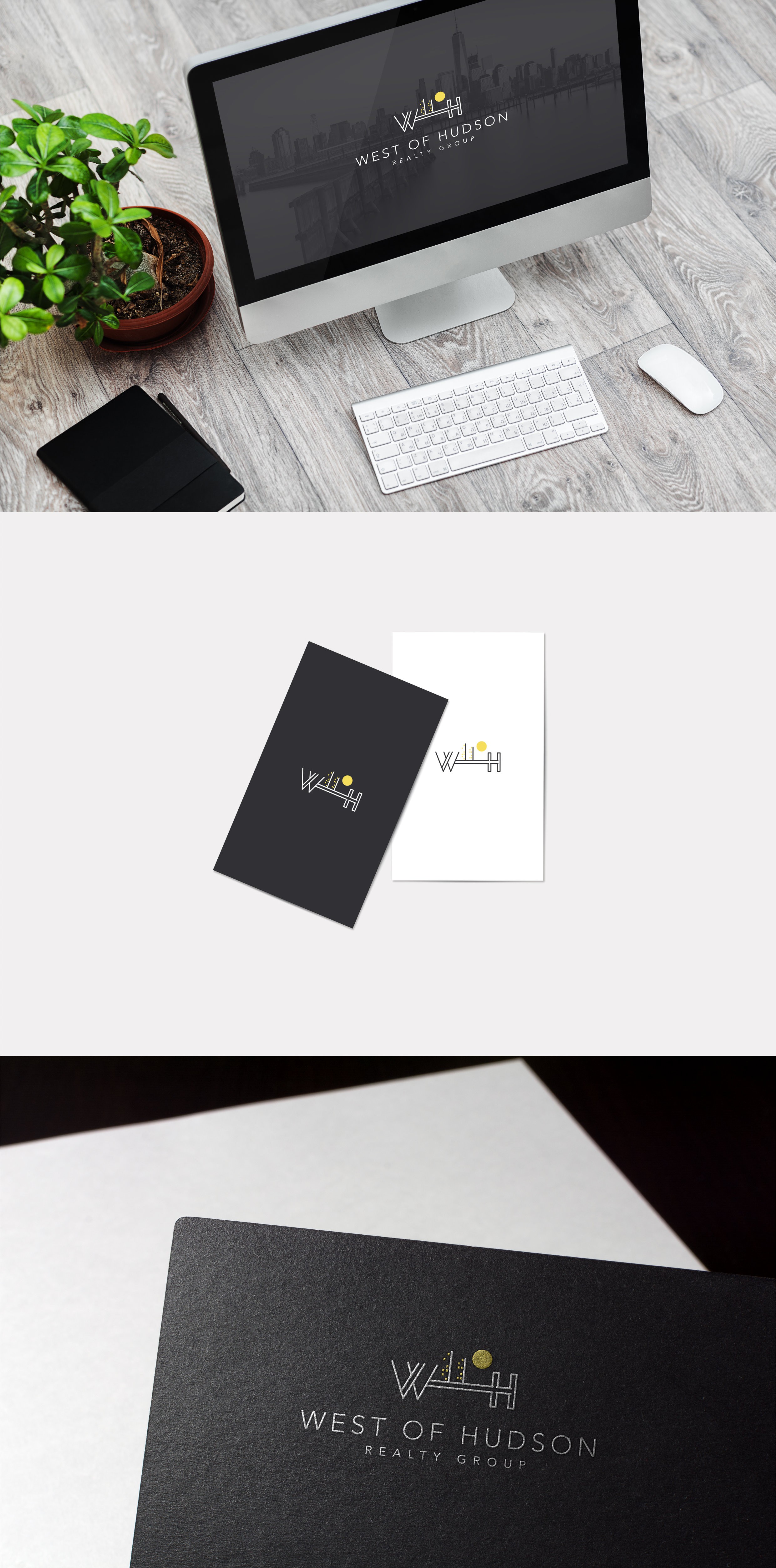
Clients desire was to emphasize their proximity to NYC but in a way that doesn't make it seem like they are in NY. We have decided to go with an abstract and geometric mark made out from the company's abbrevation. The idea was to have the view from a distance and make clear that there is a river which is separating the company from NY.