
Created on 99designs by Vista
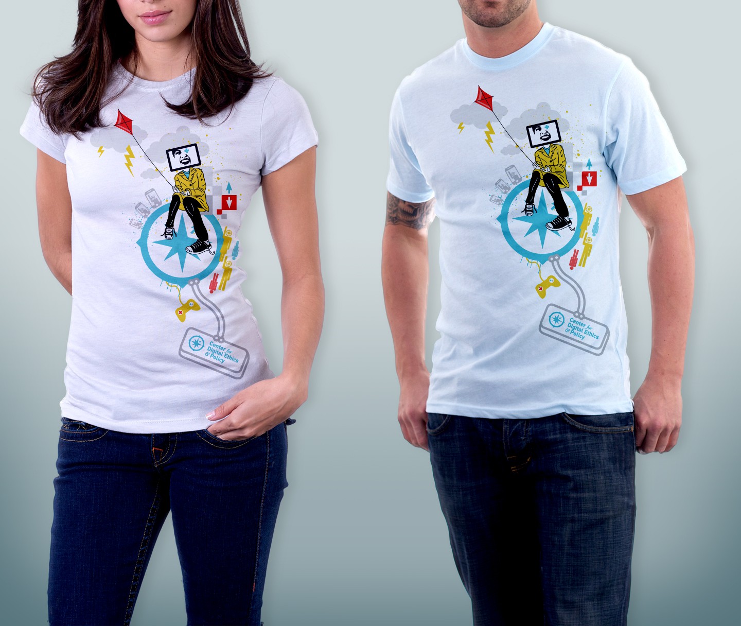
This was not a design that won the contest, but personally, I really enjoy this design. It has a color scheme based off of primary red, yellow and blue, although not in the purest sense. Using the logo mark (compass) as a center-point, I wanted to show a sense of technology/electricity paired with a fun and somewhat erratic design. The design was a vector illustrative design, with a crisp look to the colors. I think the design came out with a sense of the paradox of technology moving forward, and yet the sense of chaos that comes with it.