
Created on 99designs by Vista
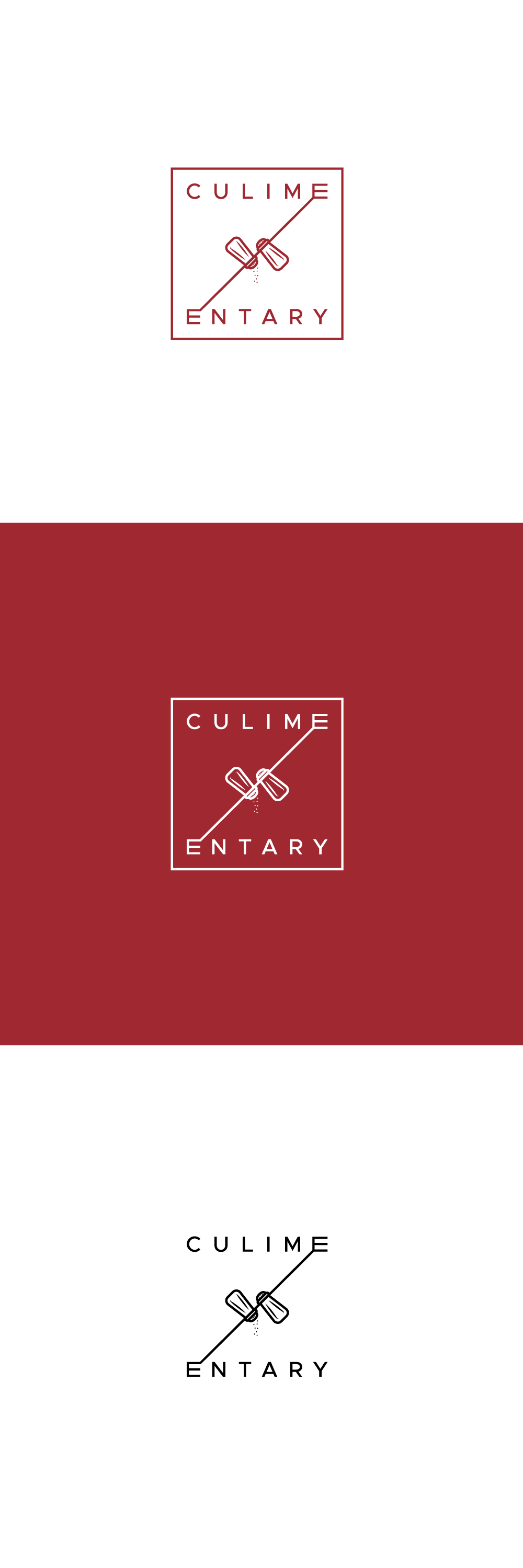
Preference was modern Scandinavian feminine logo,
in square shape, with an incorporated kitchen symbol
rather than a standalone symbol.
As kitchen objects we chose salt and pepper shakers,
as they have recognizable shapes.
Name is divided to fit in square,
and idea is that the letter E is mapped, dividing the word into two parts.