
Created on 99designs by Vista
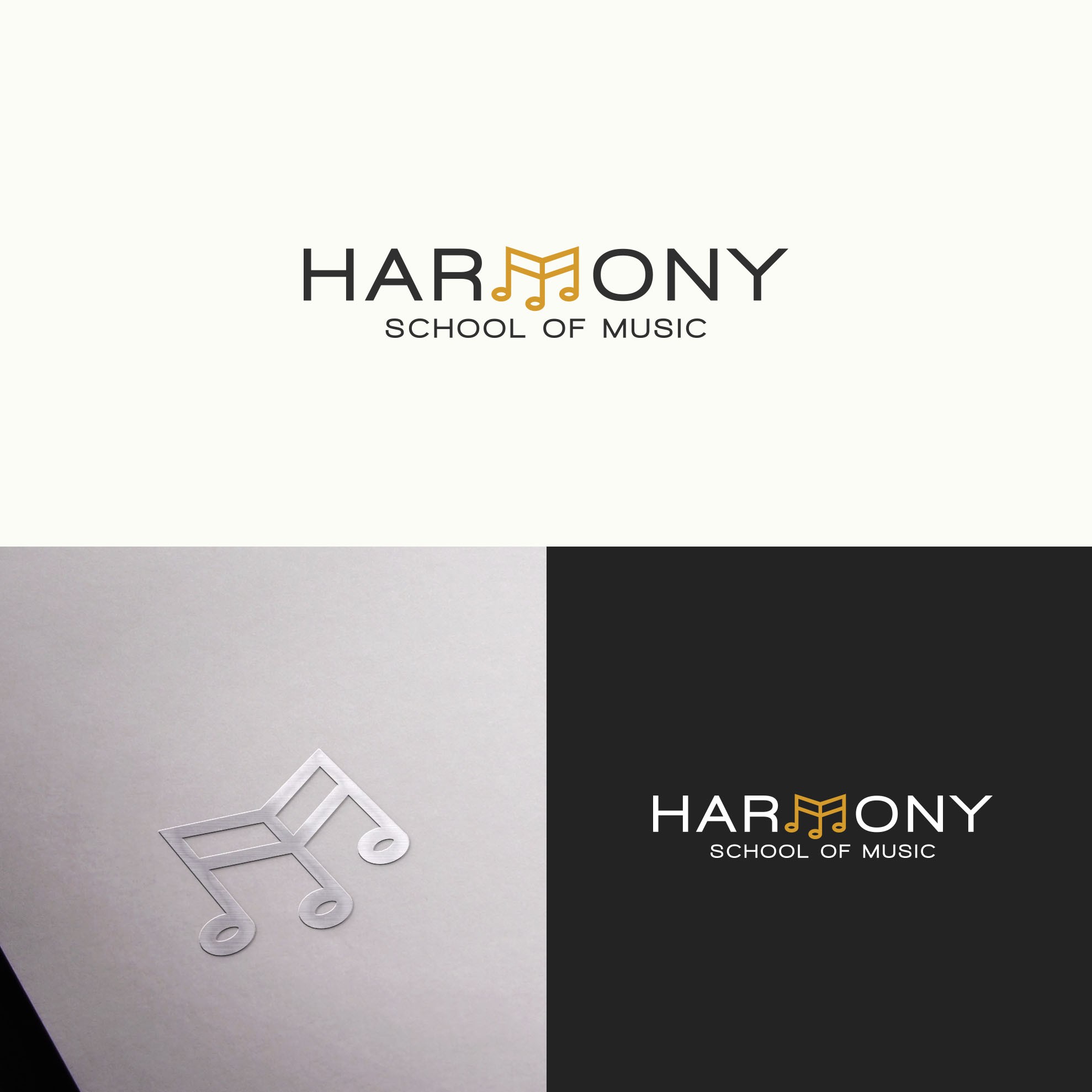
It was supposed to be like a company name: harmonious, simple and balanced.
I used the middle letter "M" which perfectly reflects harmony and balance in the whole graphic.
In addition, it is a note, symbolizing music.
Simplicity and clear message is what I wanted to convey.