
Created on 99designs by Vista
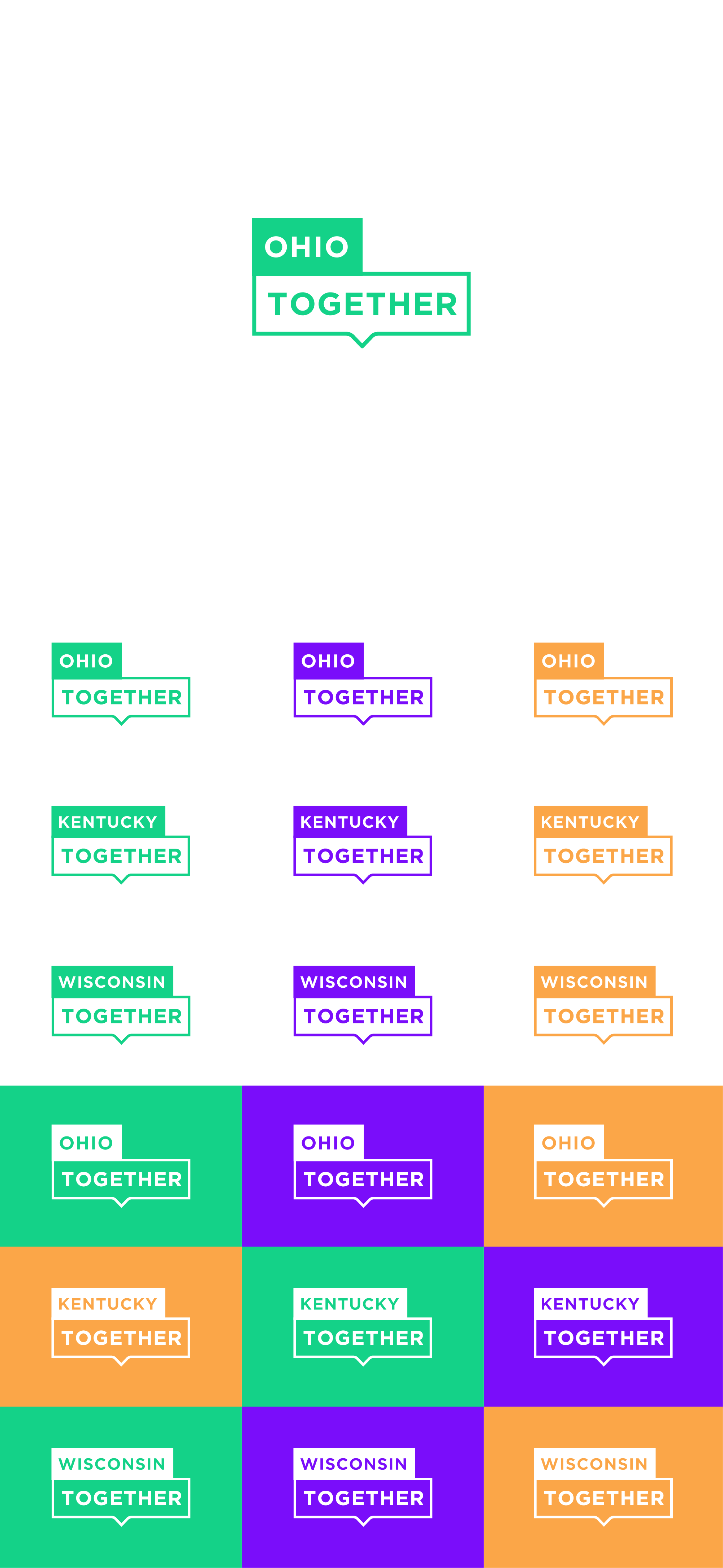
The client envisions being able to uniformly use series of logos for each state according to the initial logo instance. At first I imagined a map of the states according to the brief reference, but it was too busy and seemed uneven and far from the impression of branding. and in the end I made a minimal structure of how the states nameplate concept can be derived in a simple, clean, easy to read and meaningful togetherness and most importantly the logo is easily adjusted in various states and looks uniform.