
Created on 99designs by Vista
Although this boutique brand strategy agency isn't about skateboarding, the Kick Flip Effect team all share the interest. The Kick Flip Effect was looking for a logo to convey that they are about taking things to another level, but also keeping it fun and engaging.
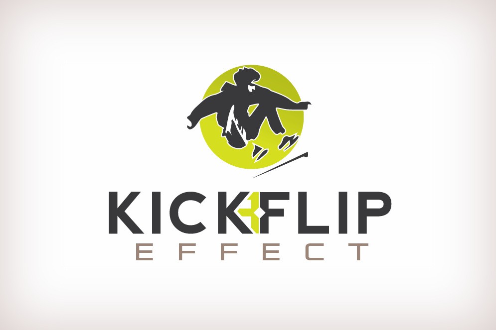
I have started by creating an icon with a skateboarder cut out inside a bright chartreuse green circle, the skateboard itself outside of the circle, "underlining" the brand, giving the brand both motion and strength.
The charcoal text is strong and legible, with a flipped design mark in the same green hue.
In the end we went with a Sky Blue palette, and I also created a small blue icon of the K and flipped F to enhance the branding strategy for smaller platforms.