
Created on 99designs by Vista
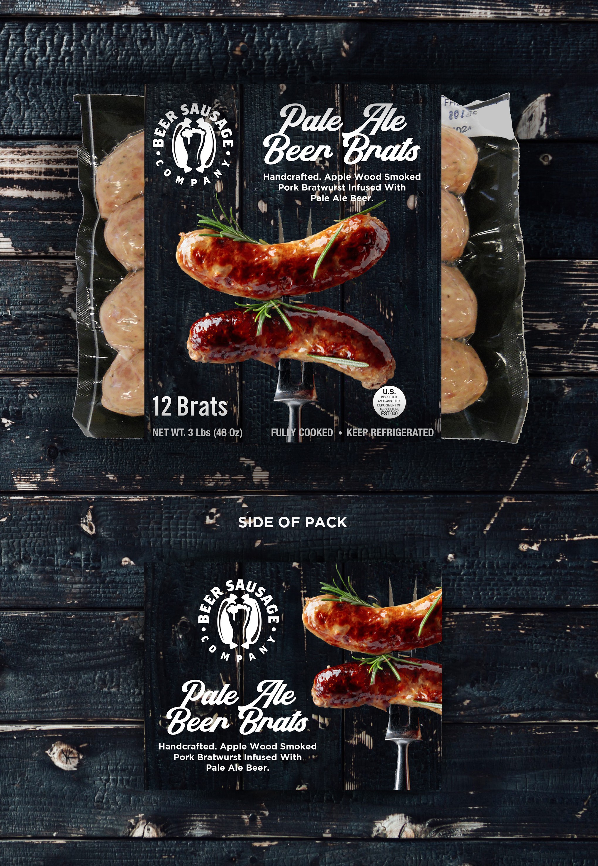
Target audience was for beer drinkers and fans of BBQs, where as other design when towards graphics that focused more on the beer side, I took inspiration for the typeface from the beer category, will remaining close to the BBQ cues for the imagery.
Photography is going to be shot of the actually product in the same style with the bbq fork. Who showcases and hero’s the product.