
Created on 99designs by Vista
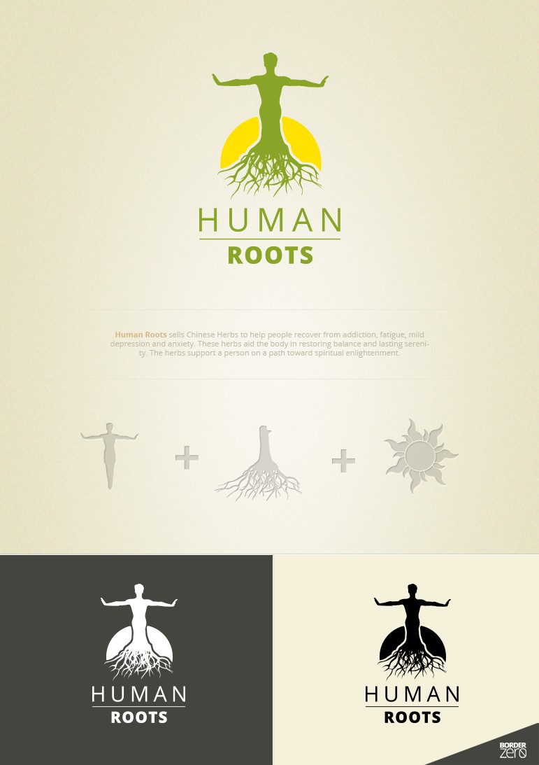
Simple logo design consisting of human body with spread aside hands, which symbolize the balance that consumers can reach using chinese herbs, tree roots symbolize reestablished life after addiction, fatigue, mild depression and anxiety, motive of the sun symbolize spiritual enlightenment reached though balance of body and mind.
Dominanting color - green. It represents life, renewal and harmony it is a restful and soothing color. Yellow represents happiness and warmth, also positivity and joy.
Perfectly balanced colors for a rehab.
This color allows to use logotype on any kind of surface and color. Although if used on colorful background I suggest using black or white version of logotype.