Created on 99designs by Vista
Rejected logo for disposable meal kit online seller company.
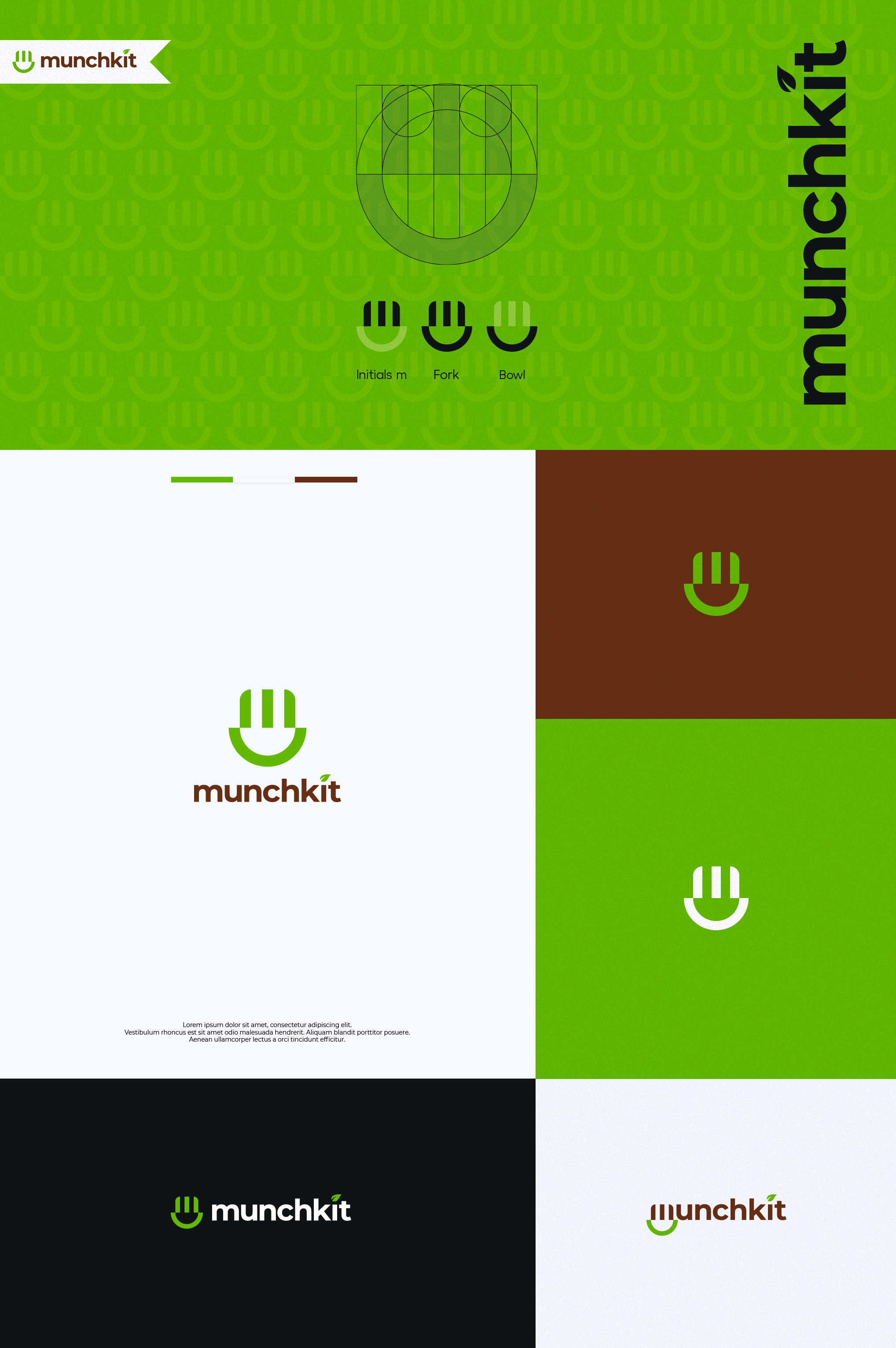
The logo concept is Initials m, fork, and bowl symbol. Initials m could represent the name, fork and bowl to represent about meal kits/cutlery. The icon structure is very simple. Build from several circle and rectangle shape, it also carefully crafted to have a well balance on each part.
I choose Montserrat Bold font on the logotype and modify the letter "i" to have a leaf symbol on it. Using earth tone color scheme that could help emphasize about disposable compartmentalized meal kits and bamboo cutlery.
The font is also matched with the icon. It give the looks of clean, fun and modern.
