Created on 99designs by Vista
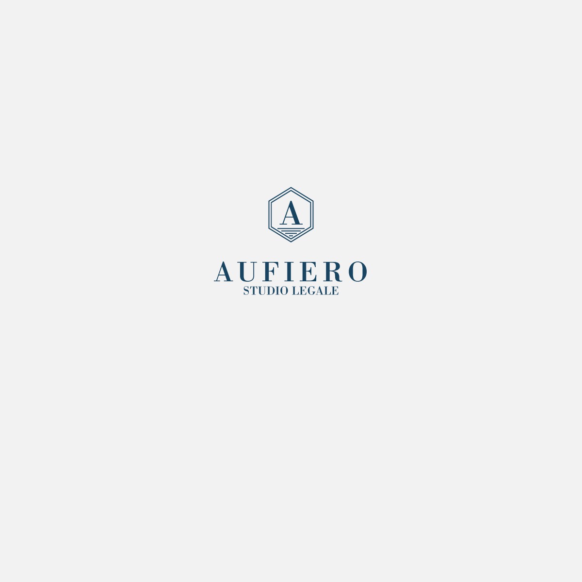
This logo was created for an italian law office. Aufiero, indeed, is the surname of the family working on the legal field.
The client wanted a logo able to convey a feeling of strength and lastingness, but also modern somehow. Great importance had do be given to the name "Aufiero".
So, the lines of the design are thin and minimal, while the Capital Letter A stands on the middle of the vertical hexagon and attracts the attention of the observer.
At the same time, being the law office an italian one, I wanted somehow to introduce a small hint to the sea. The four horizontal lines under the A represent calm waves.
The logo is mono-color. A deep, classic blue means trust, dependability and loyalty to the cause.
