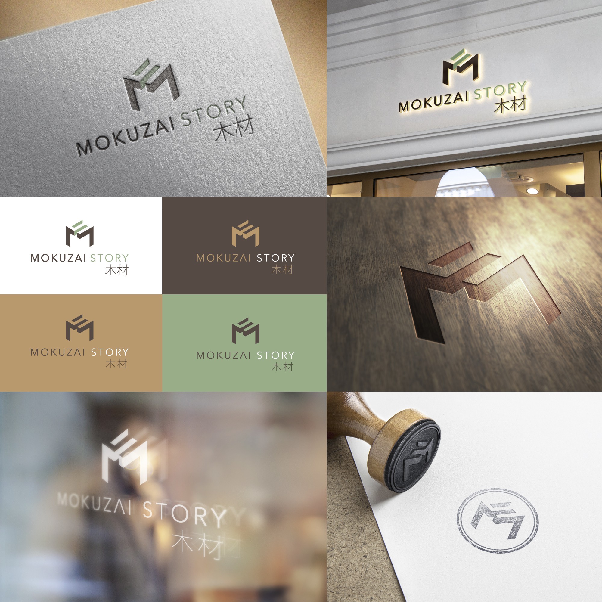
Logo for Mokuzai Story

32
Created on 99designs by Vista
Visual identity for a company developing Carpentry in commercial projects.
The minimalistic geometric shape, explores the aesthetics of a carven wood block.
The word Mokuzai derives from the translation from English 'wood' to Japanese. The characters 木材 (the same in Japanese & Chinese characters.), also standing for wood, were used as a reference to ancestral tradicion of wood craftsmanship.