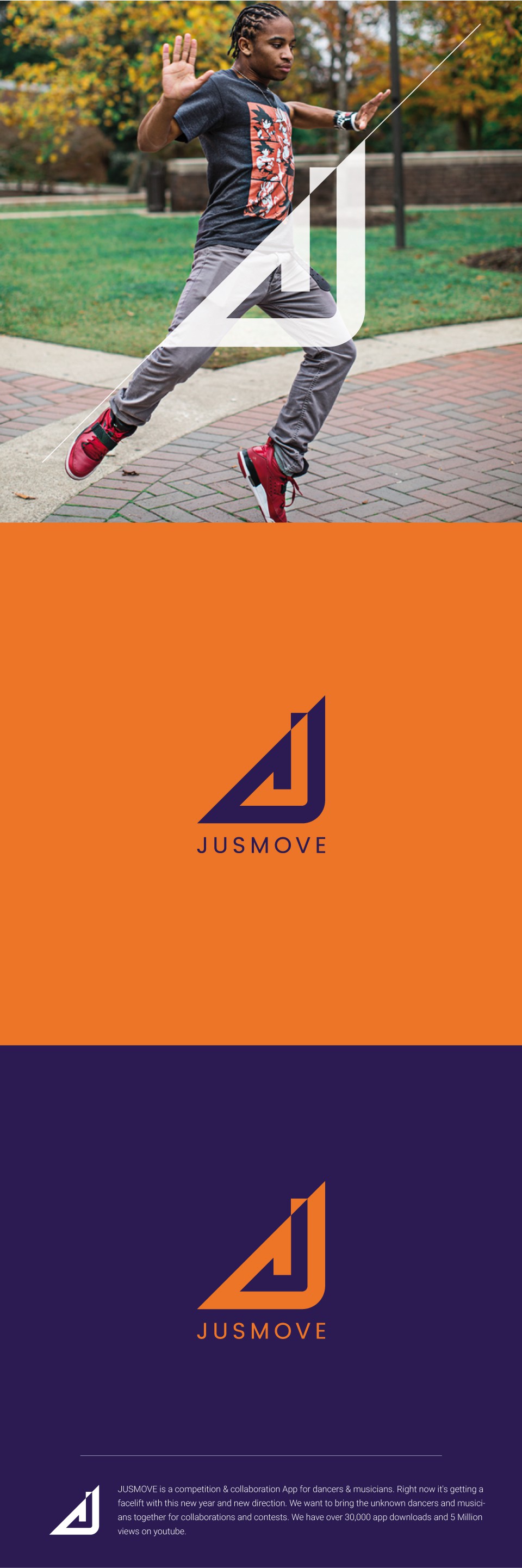
The logo shows the letter "J" as an arrow which stands for the movement. I wanted to get away of an overused shape of the letter "M".