Simple geometric initial for civil engineering firm

26
Created on 99designs by Vista
January 2015
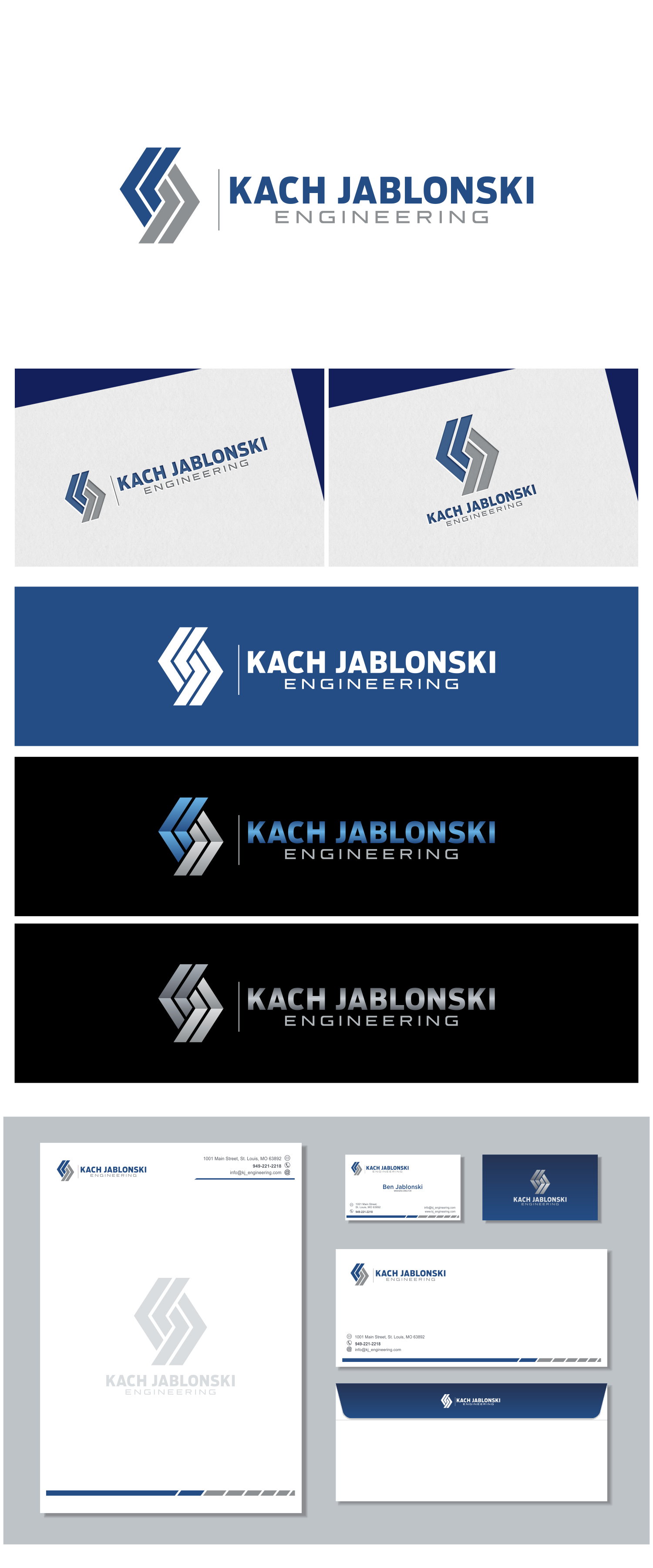
The concept of the logo is to bring the initials of company name into a form that is simple and reflecting the field of civil engineering. The concept was implemented into the pieces of K and J that are intertwine symmetrically and geometrically. The use of accent lines that divide symmetrically both pieces are strengthen the impression of civil engineering business. The pictorial mark is combined with typography that strong and elegant so not causing stiffness. Logo is easy to keep in mind and also easy recognized when standing with other brands.