A Symbol of Growth, Learning, and Progress

67
Created on 99designs by Vista
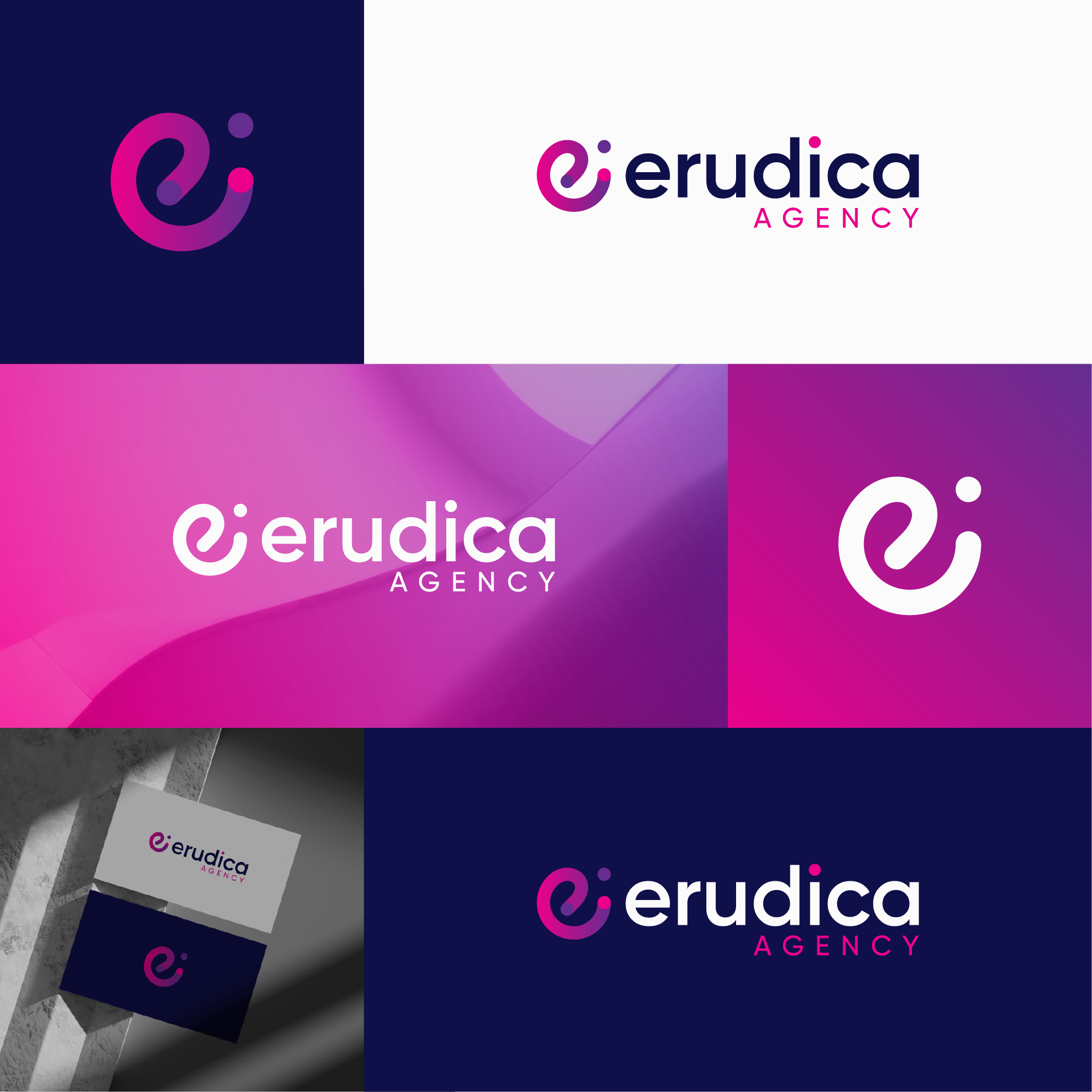
The logo for Erudica Agency features a stylized “e”, symbolizing education, empowerment, and evolution, with a gradient curve representing growth and continuous learning. The two separate dots in the design—the dot near the "e" and the dot over the "i"—symbolize new challenges along the learning journey, reflecting the hurdles and milestones a learner encounters while developing their skills. The flowing shape of the “e” reinforces this dynamic journey, adaptability, and progress, while the modern and minimalist design keeps it professional yet inviting, perfectly aligning with a creative and forward-thinking audience.