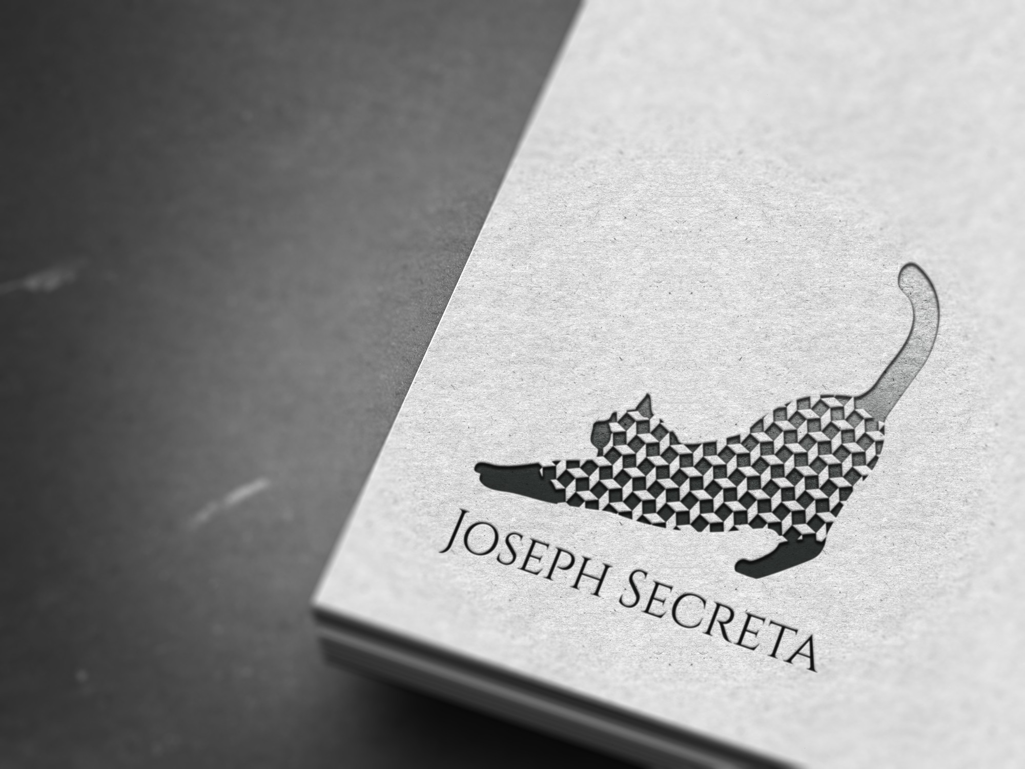
Joseph Secreta Cat - Sharp, Sophisticated, Endearing
0
Created on 99designs by Vista
The "moving" squares give more dynamism and dimension - energy and playfullness - to the basically minimal and flat logo. This pattern, even with all the white spaces in it, still draws out the silhouette of the lovely streching cat perfectly, without the need of drawn outlines, by leaving more to the eye with optical illusions. A logo without outlines looks more free and elegant. With all this maneuver, it can target a wider group of clients, yet still stay noble. The appearing optical illusions also reflects the artistic and entertaining self of the organization.
