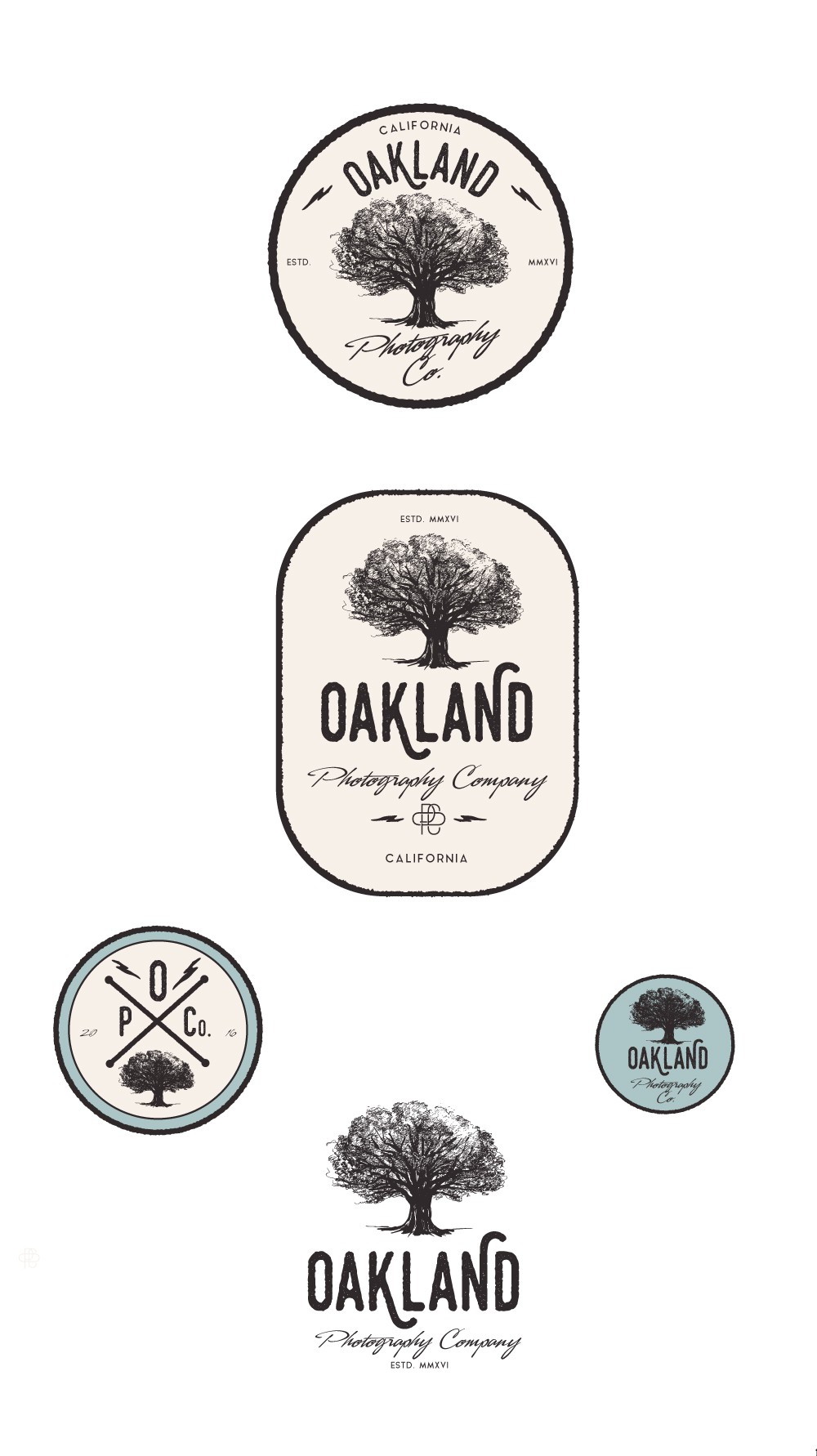
Logo for Oakland photography company.

155
Created on 99designs by Vista
Initially the client wanted a port crane on the logo, finally it is the oak, another symbol of Oakland that has been retained. An old side was desired: it is given by the sketch of the tree, the choice of fonts, colors ...