Creating Million Dollar Messages

48
Created on 99designs by Vista
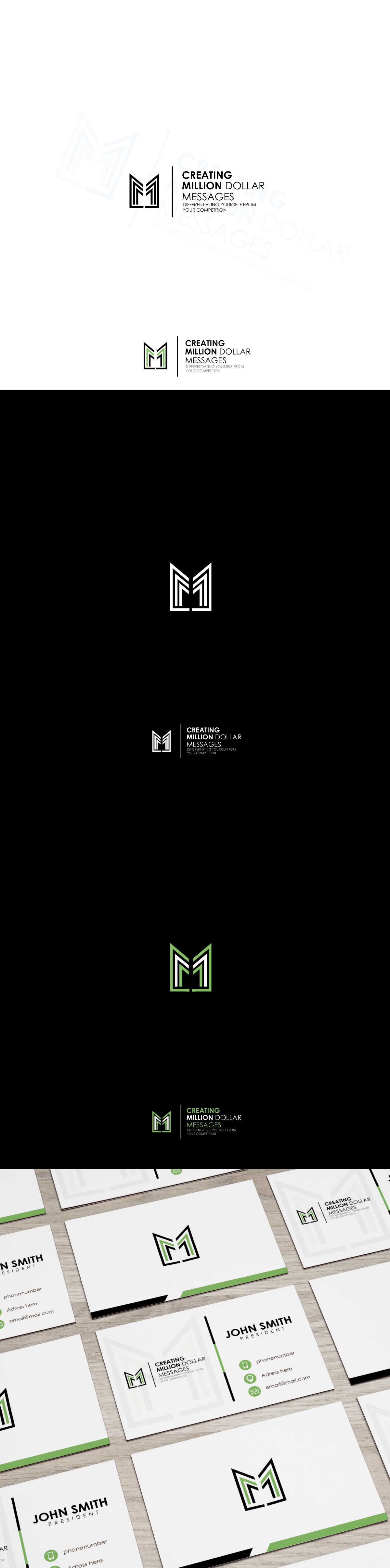
This was a project outside of my comfort zone, but I decided to give it a try anyway. Client wanted affluence and prestige university look, something simple but recognizable to represent his identity. This was a logo for a course that is part of a Business University. I decided to go with a double M, stylised into attractive icon. Fun project.