Simple, minimalistic logo for software company

40
Created on 99designs by Vista
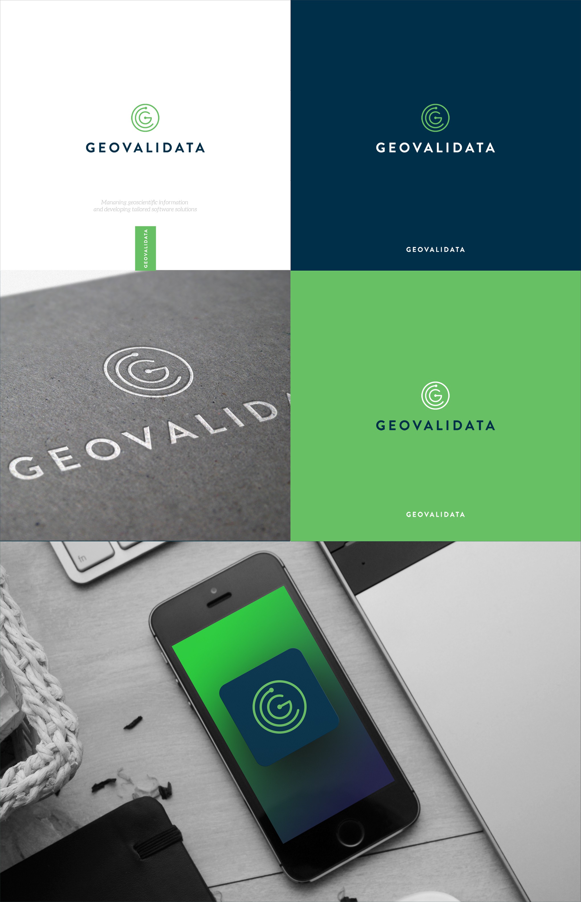
My major intention with this design concept was to make the simple, clean and one-two colors design. I used the circle line to emphasize the geo aspect and put the letter G inside in the center. The line around the letter has also the little circle at the end - as a scientific / tech detail of the design (flow of the information and software solution).