Universal logo for a small brewery

2
Created on 99designs by Vista
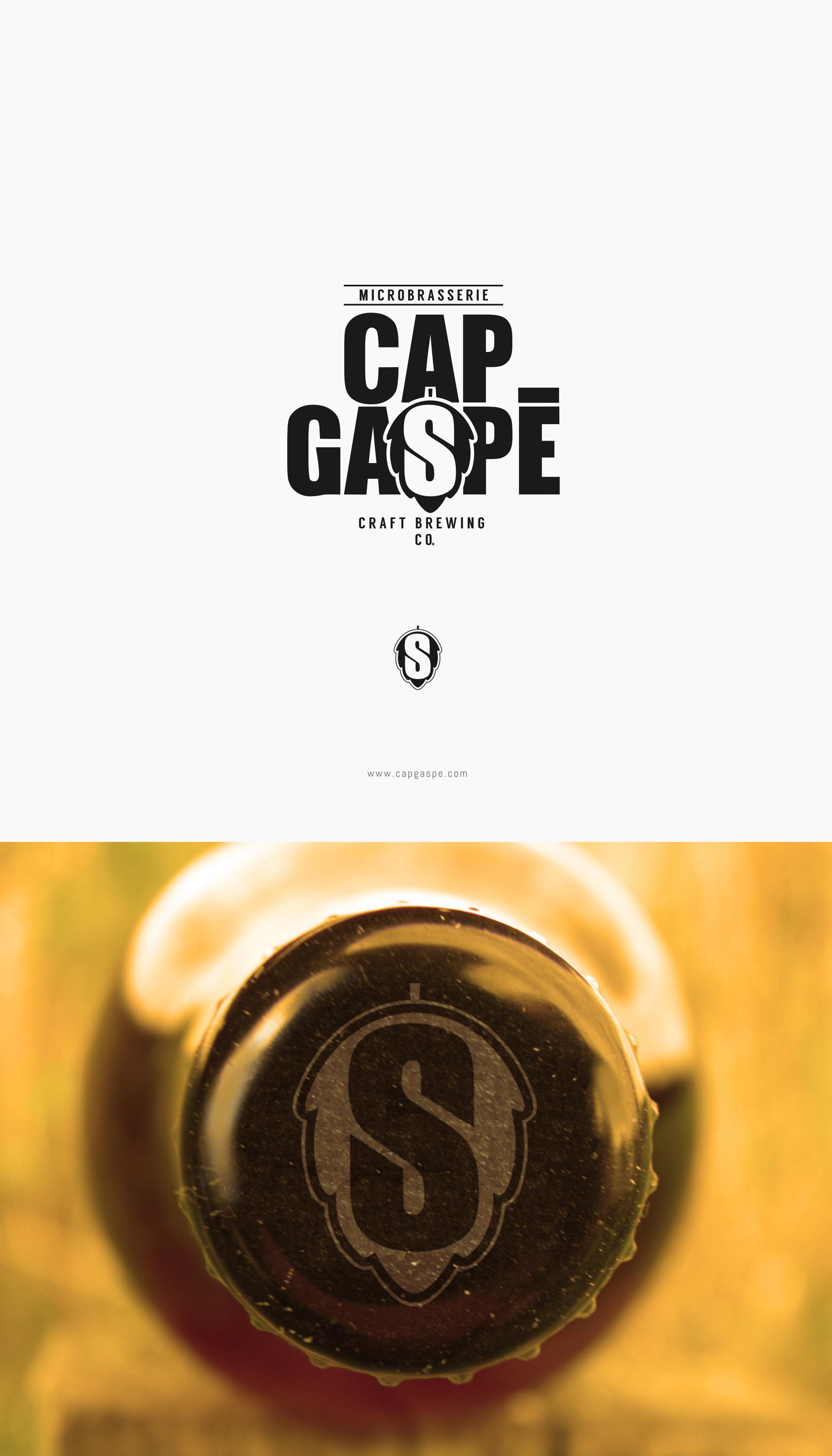
The Contest Holder wanted a modern, simple and eye-catching logo that would represents his small brewery. He would like to be able to use the logo without the lettering as well. Taking that into consideration, I created a logo that included a pictorial shape of the hop, that would work well separately on the bottle cap for example. Bold lettering focuses attention on the name of the brewery.