Business Card Mock Up: Røyken Hundebarnehage AS

0
Created on 99designs by Vista
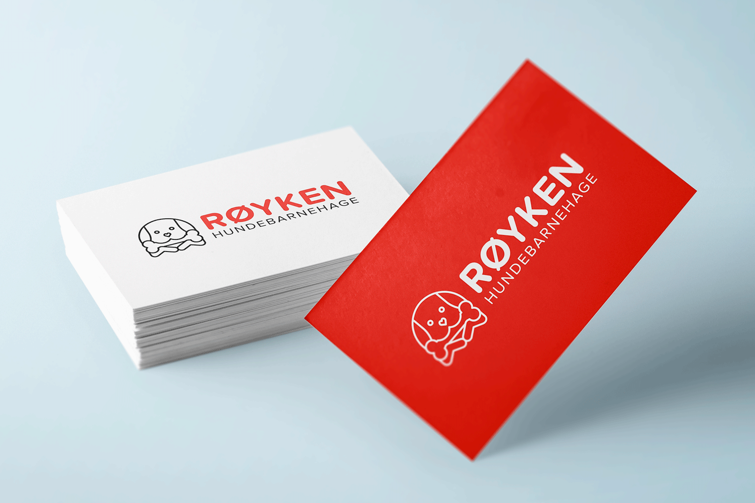
The overall design of the Røyken Hundebarnehage AS logo is clean and minimal for an appealing, modern aesthetic. The rounded, sans serif font compliments the soft appearance of the graphic and evokes a friendly, approachable business. With soft edges, the logo has a feminine appearance but should appeal to both genders.
With a minimal colour palette, the logo is ideal for low budget printing requirements. The horizontal layout maximises the use of space and would be suitable for web use and promotional merchandise (e.g. pens, bags).