Create a strong and trustworth LOGO for an agribusiness company / Crie uma LOGO forte e de confiança para empresa rural

1
Created on 99designs by Vista
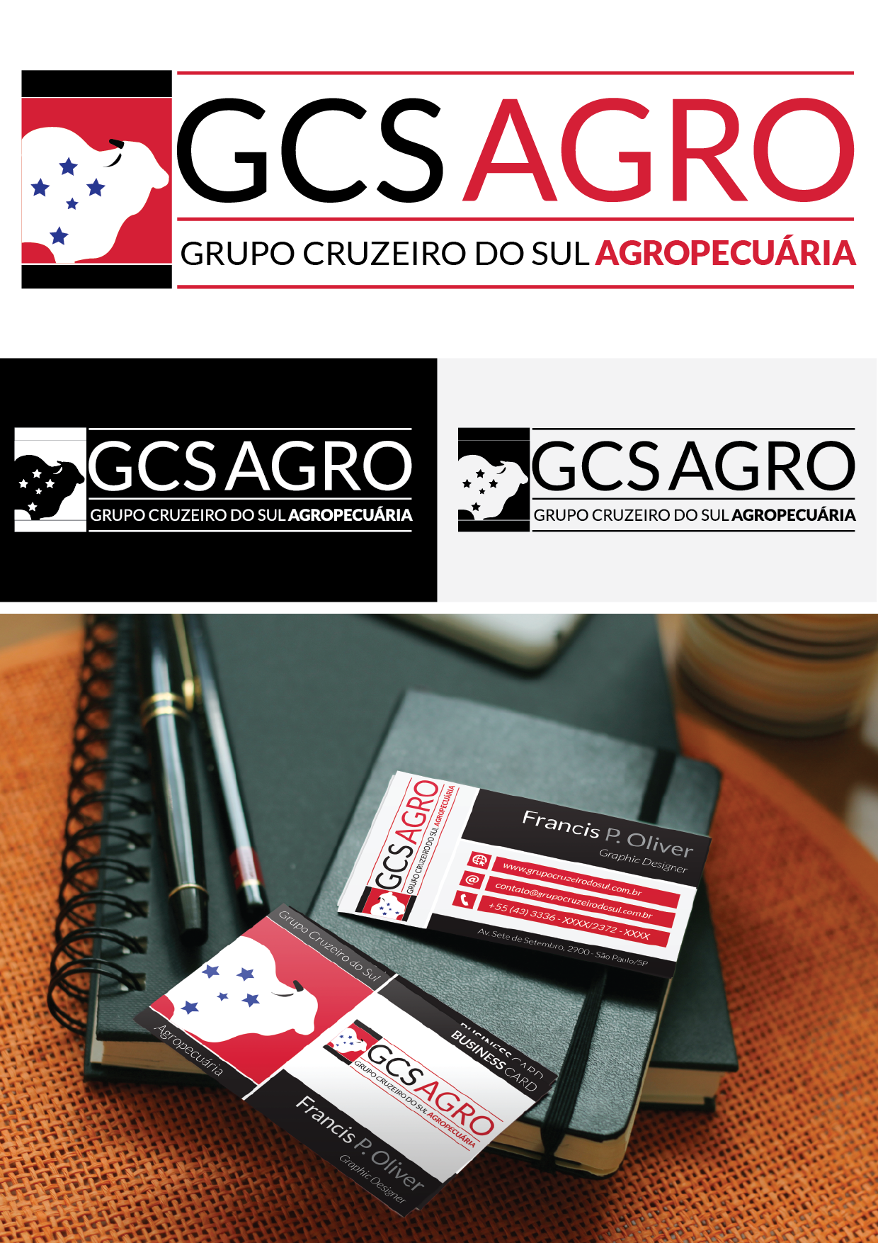
As with other proposals, tried to keep this a certain lightness, while the theme suggests "stiffness", sought to add lightness graphic piece not to "attack the eye of the beholder."
And as said in a similar proposal, the shade of red used here suggests adding strength to the brand, but without being aggressive in the eyes of the beholder.