Create a strong and trustworth LOGO for an agribusiness company / Crie uma LOGO forte e de confiança para empresa rural

0
Created on 99designs by Vista
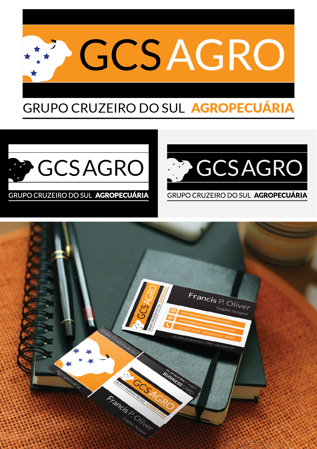
When I concepted this logo, I tried scape from de "obvious" and "expected" - I avoided use lined drawings or detailed shadows of ox, using just a slight abstracted silhouette to refer the branch of the company operates.
I used, in this version, gold and black tones in reference to something luxurious and noble.
As requested, I kept the Southern Cross, but here its serve as a mark in the "leather" of the animal.