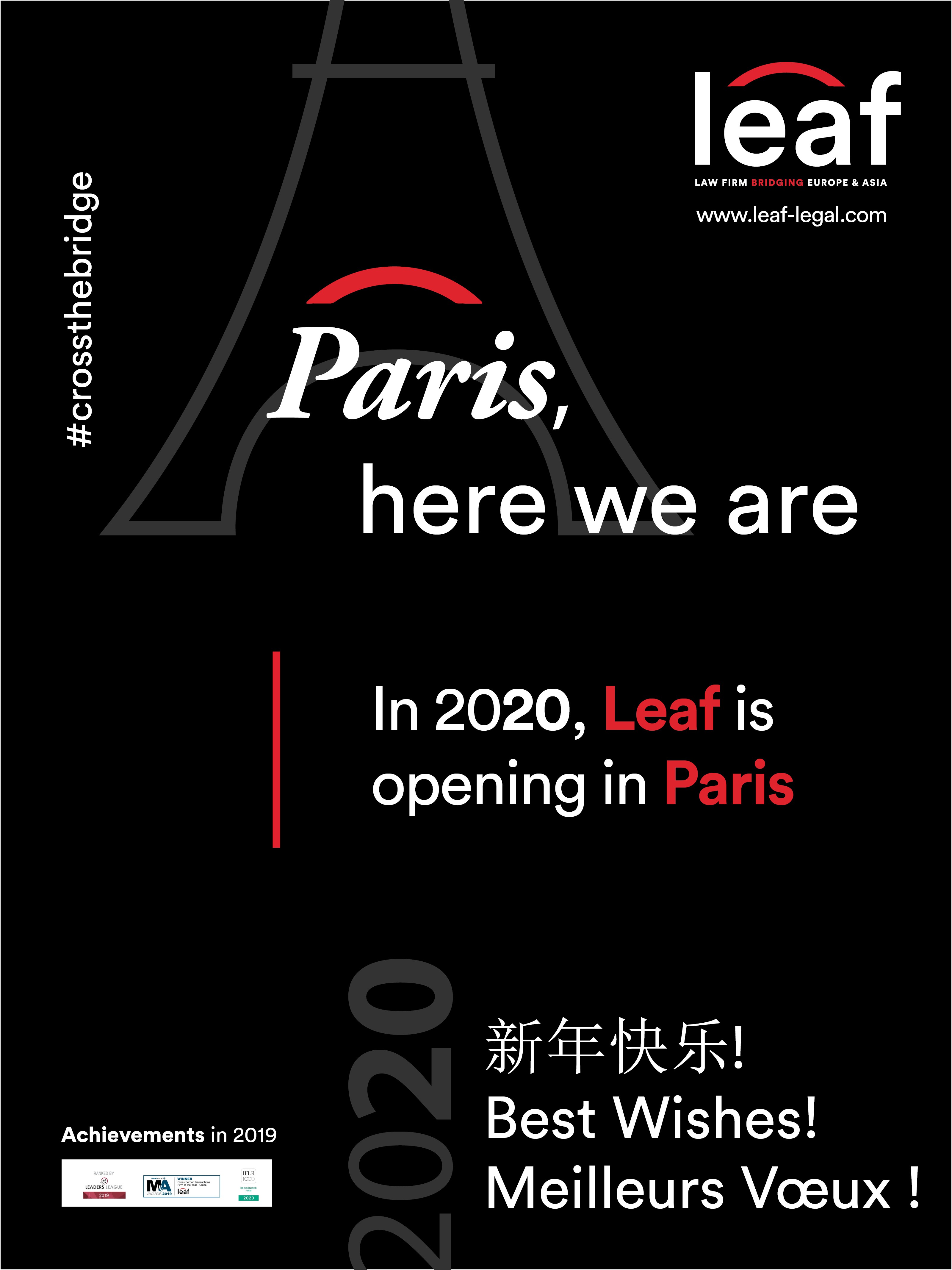

Created on 99designs by Vista
based on color black &red palette, we went on a tyographic hierarchy to highlight message. mixed with a simle but powerful symbol to add geographical indication.
we have as result a simple but efficient and pleasant to read poster card that translates the brand