
Created on 99designs by Vista
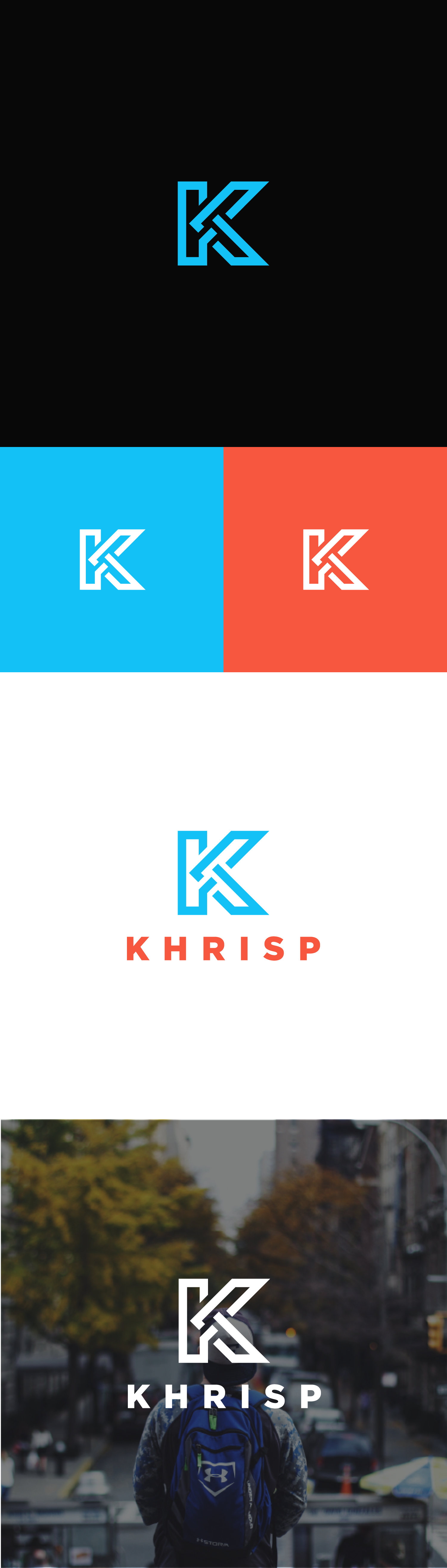
The "K" was made with one single line, to represent continuity, and the vibrant colors give the sensation of an active and edgy brand. The stroke is bold to give a strong feel, but it's also very friendly and not intimidating.