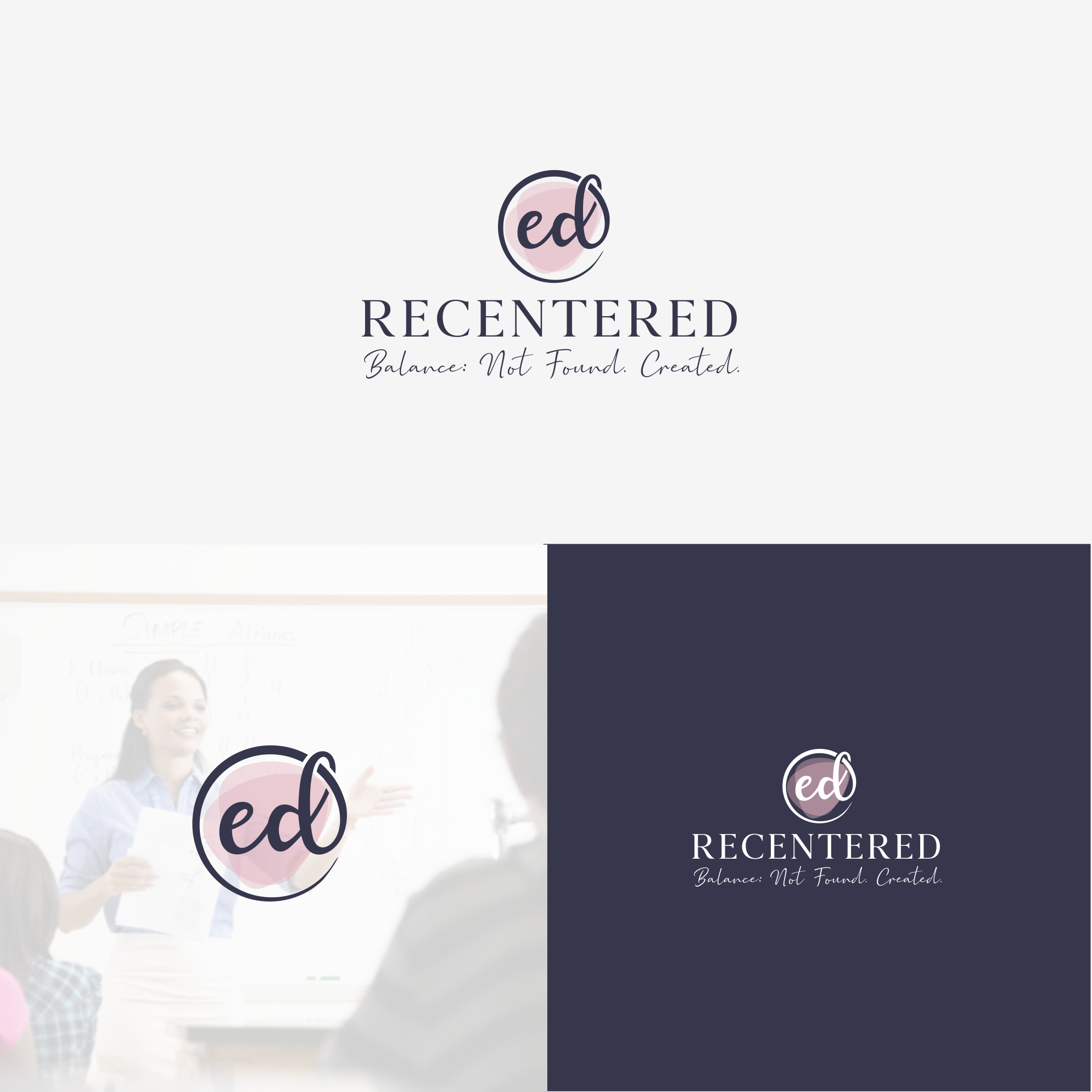
The client wanted an emphasis on “ed” and the symbolism of recentered. I think I managed to show it in the logo.