Logo for health tech company

0
Created on 99designs by Vista
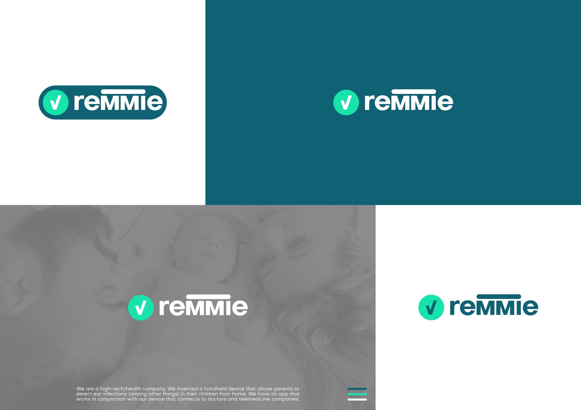
The company produces medical devices and directs its focus towards parents and children. The idea behind this logo was to have a friendly simple font combined with elements from contemporary UI design (the chekmark and the rounded capsule-like shape used for buttons in apps). This way i tried to achieve a design that is linked to technology but also to the concept of chekup.