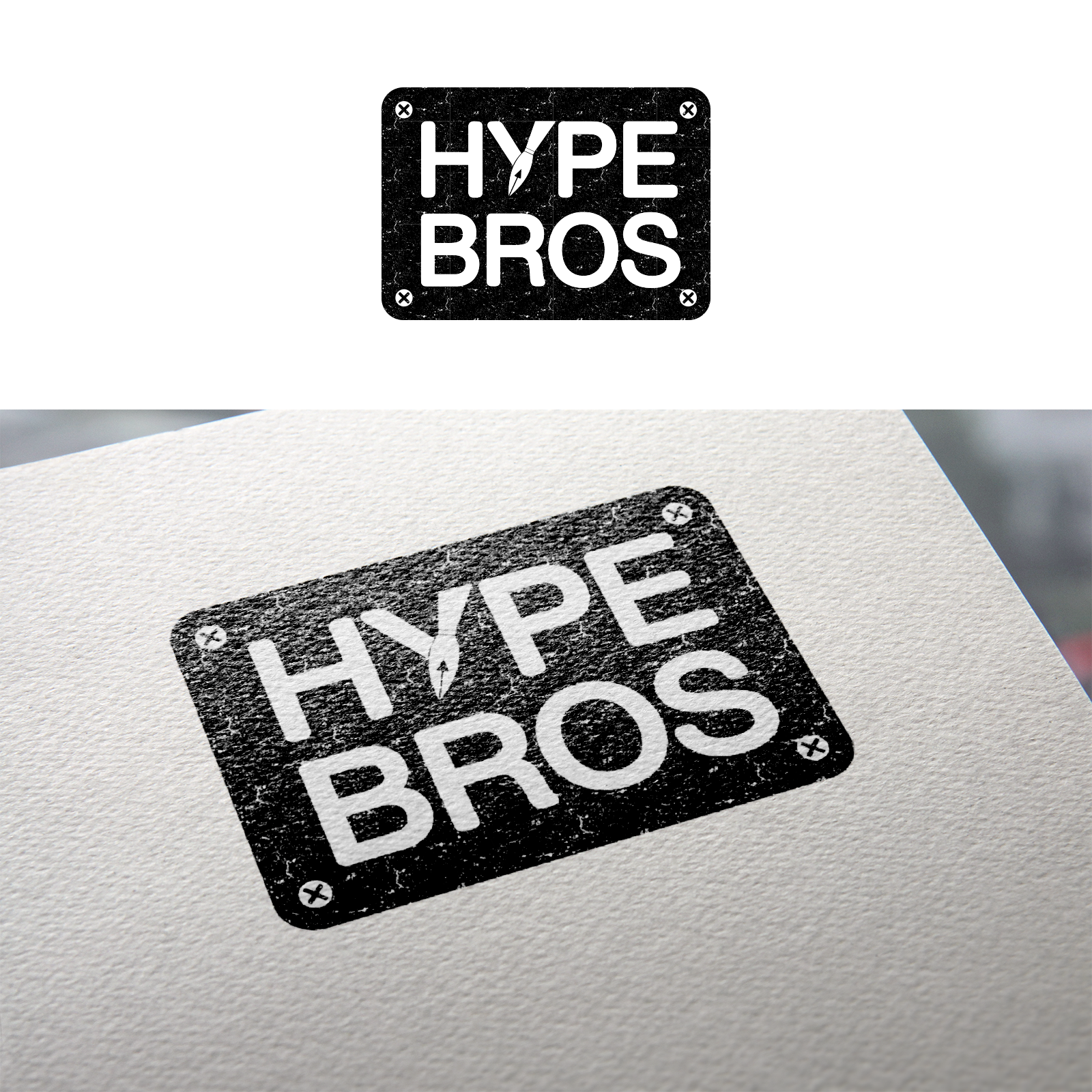
Vintage style logo for marketing blog

215
Created on 99designs by Vista
They were looking for a clean and strong style to represent their marketing blog.
I've combined the Y letter with the pen tip, also made it look like a sign plate mounted in screws and used a texture for a vintage effect.