Crafted and balanced mark for Benedictine Sisters, Elizabeth, NJ
 by Ian Douglas
34
Created on 99designs by Vista
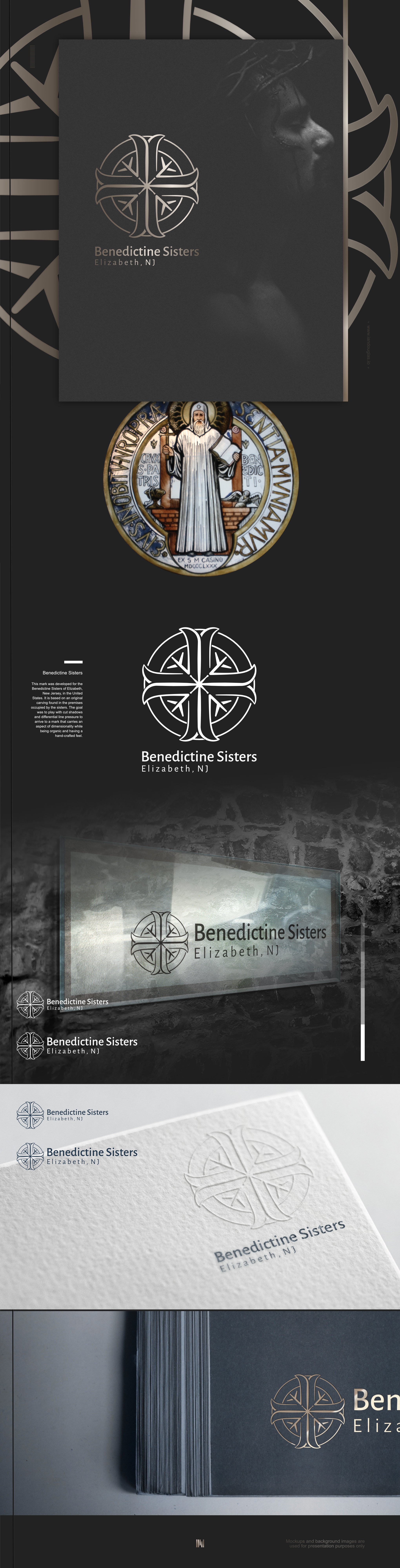
The Benedictine Sisters of Elizabeth, NJ, sought a logo derived from a carving found in the premises they inhabit. On first sight, it seemed a very straightforward project. But beauty is not straightforward, and unique isn't either. It took considerable time to carefully arrive to this mark. The craft is in the detail of the lines and the curves and the balance and harmony achieved through subtle differences in weighting across the mark. The mark also uses negative space to create dimension and uniqueness.